OVERVIEW
The image-to-image technology is a B2B product under Huhu AI that enables SMBs and fashion brands to generate highly customizable AI model images using reference photos. It also served as a demo for enterprise clients, offering a sneak peek at the underlying technology during pitches.
MY ROLE
IC Product Designer
TEAM
1 Product Designer (Me)
1 Product Manager
1 ML Scientist
1 Front-End Engineer
1 Back-End Engineer
TIMELINE
Oct 2025 (2 Weeks)
CONTEXT
Huhu AI's B2B Self Serve pipeline provides fashion model generation and virtual try-on technology for SMBs.
There are two parts of the service: creating AI models with user-selected traits (e.g., gender, race, age) and generating try-on images. The company targets fast fashion companies aiming to save costs on traditional fashion photoshoots.

AI Fashion Model Generation
AI Virtual Try-On
CHALLENGE
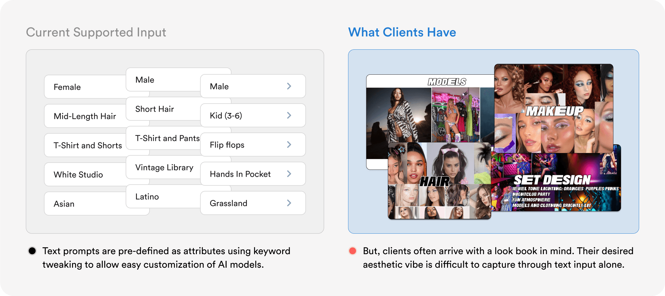
Text prompts are insufficient in capturing clients' vision.
Initially, the AI model creation feature was basic: users could select from predefined attributes via dropdown menus, and the system would generate an image based on those selections. However, this approach didn’t address a crucial need: capturing the client’s envisioned aesthetic, which is often better conveyed through images than text prompts.
CONSTRAINTS
For this MVP, the team aims to prioritize more stable and reliable results by limiting flexibility on the user end—specifically around prompting and parameter tuning.

Given the strict timeline, I adhered to the existing text-to-image generator layout to streamline the design process and support faster implementation.
PROBLEM STATEMENT
How might we balance ease of use, output stability, and customization in AI fashion model image generation?
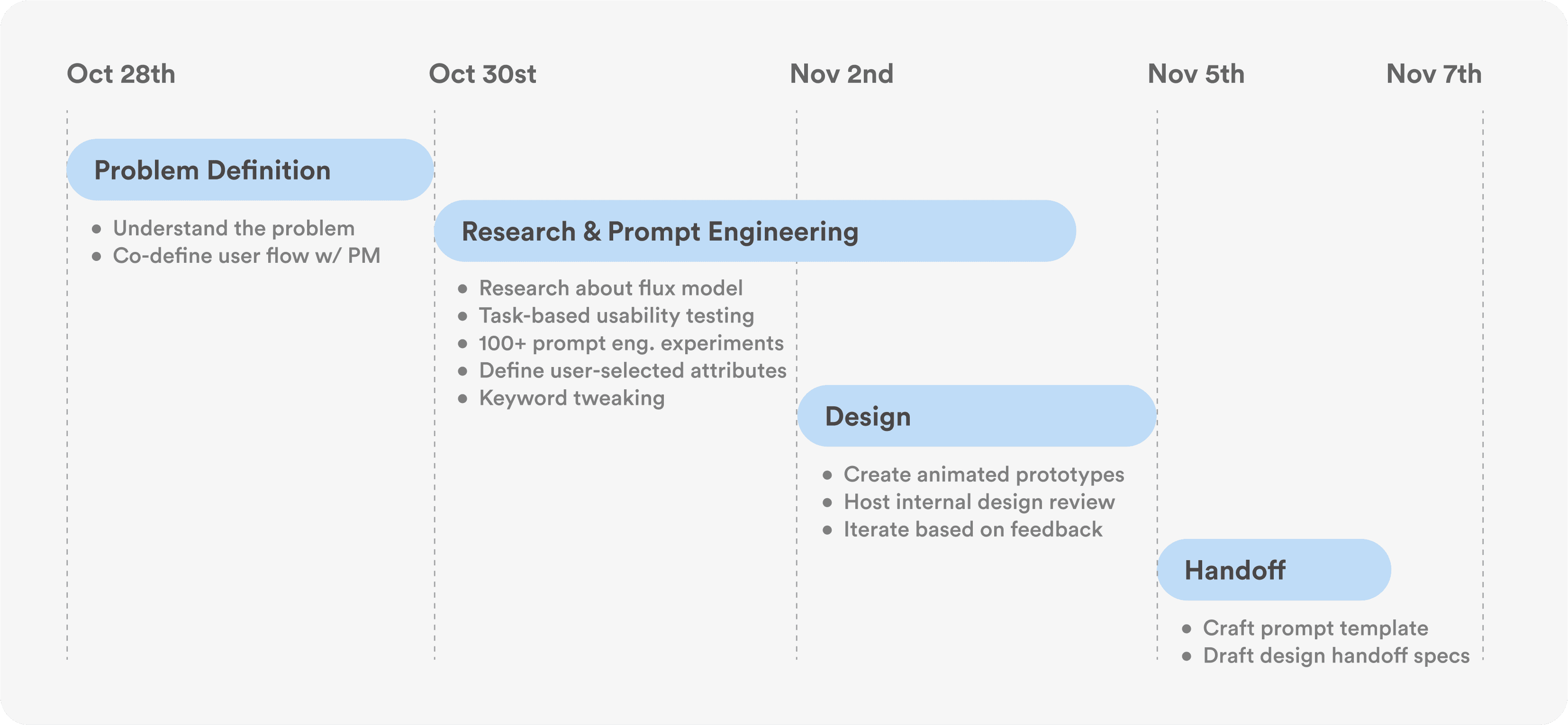
PROCESS
From research & prompting to design & iteration.
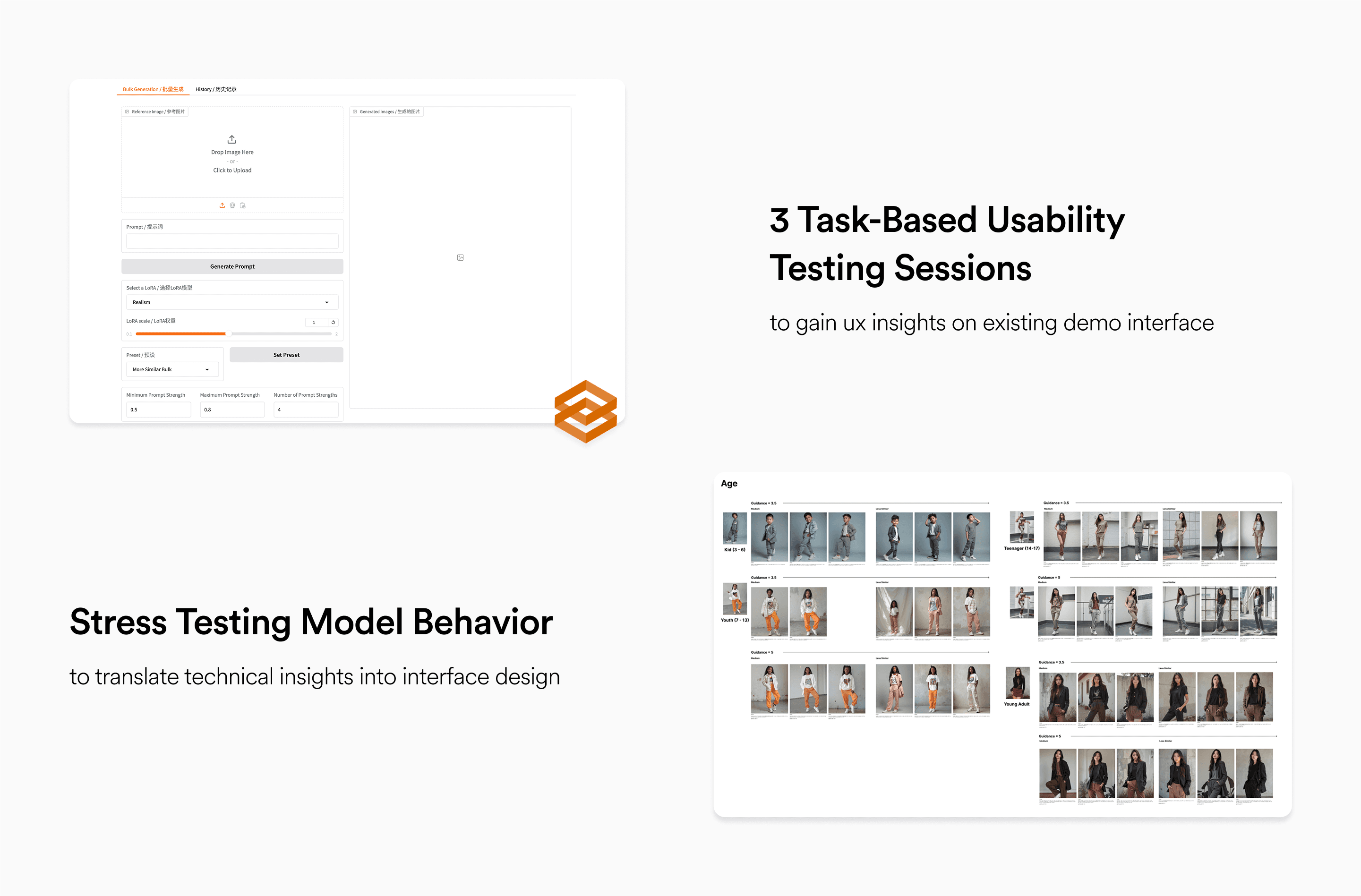
I conducted usability testing sessions with internal team members using our initial demo hosted on Gradio to identify potential usability issues. In parallel, I carried out hands-on research with the underlying image generation model to inform more intuitive and user-centered design decisions.
IMPACT
Researched, designed, and delivered the feature in just two weeks, achieving great impact.
Monthly Active Users
CTR compared w/ traditional photoshoots
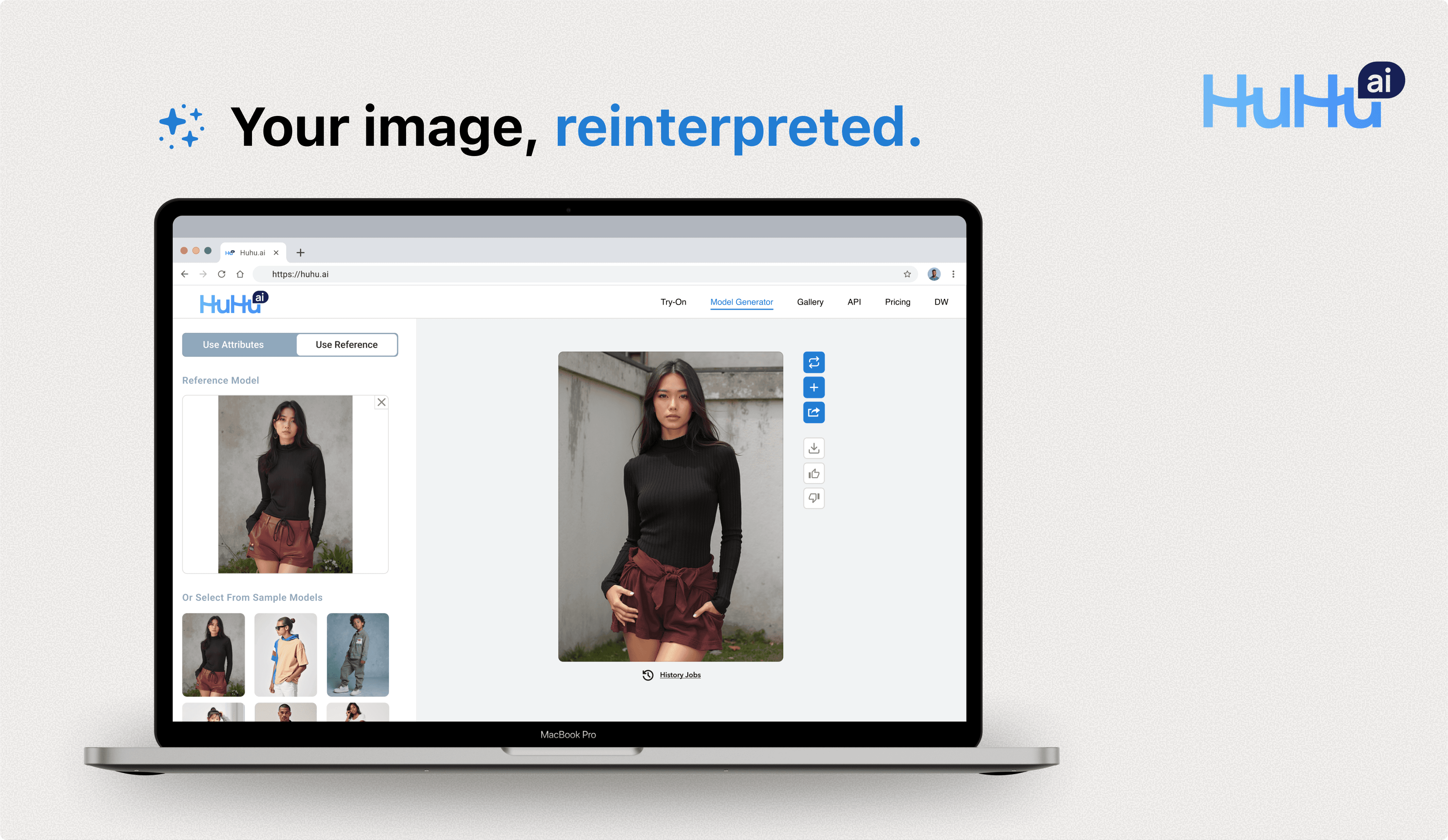
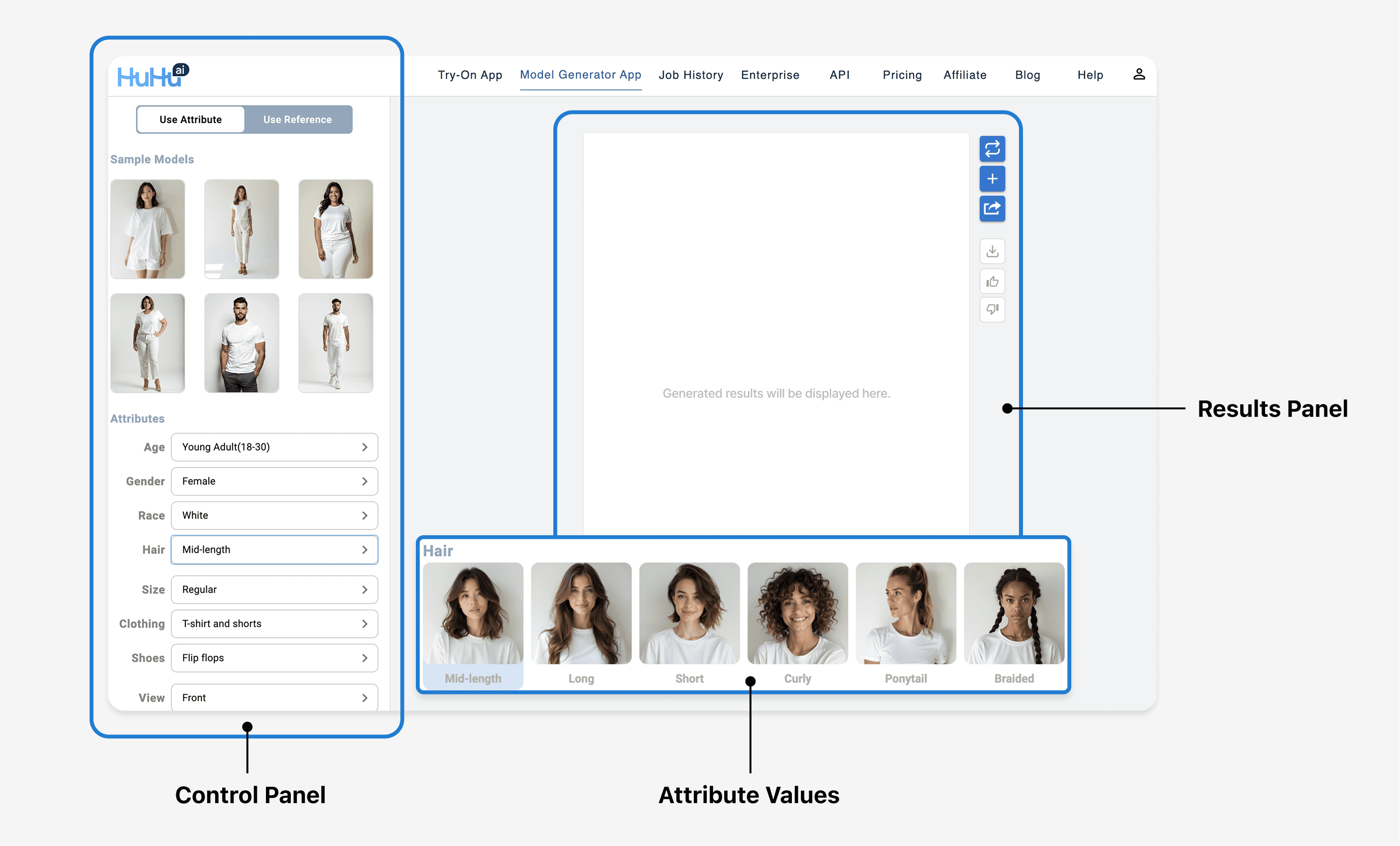
FINAL DESIGN
DESIGN DECISIONS
Co-shaping UX with empirical model insights
My design process combined usability testing with hands-on model exploration to inform actionable improvements.
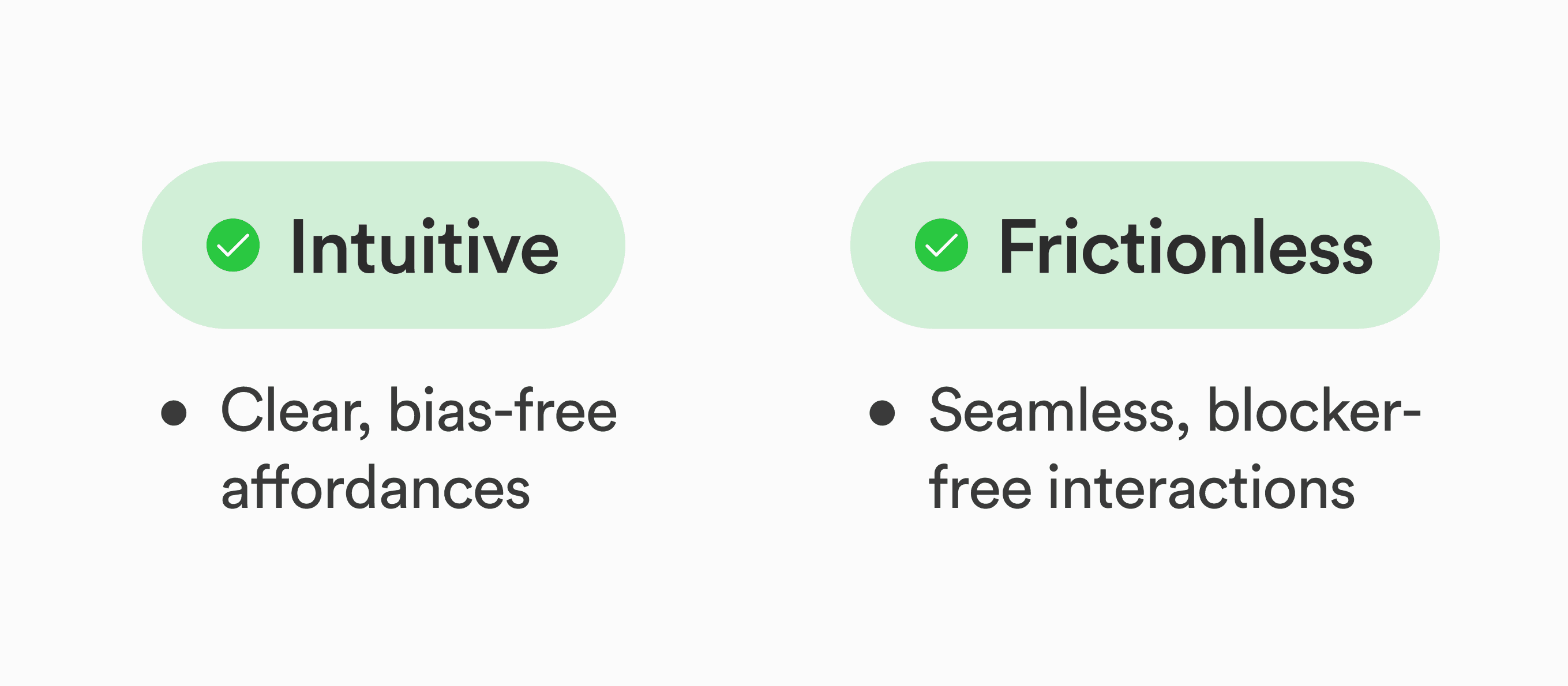
For the initial launch, I aimed to deliver a straightforward and highly controllable experience. Therefore, I focused on two design principles: intuitive and frictionless.
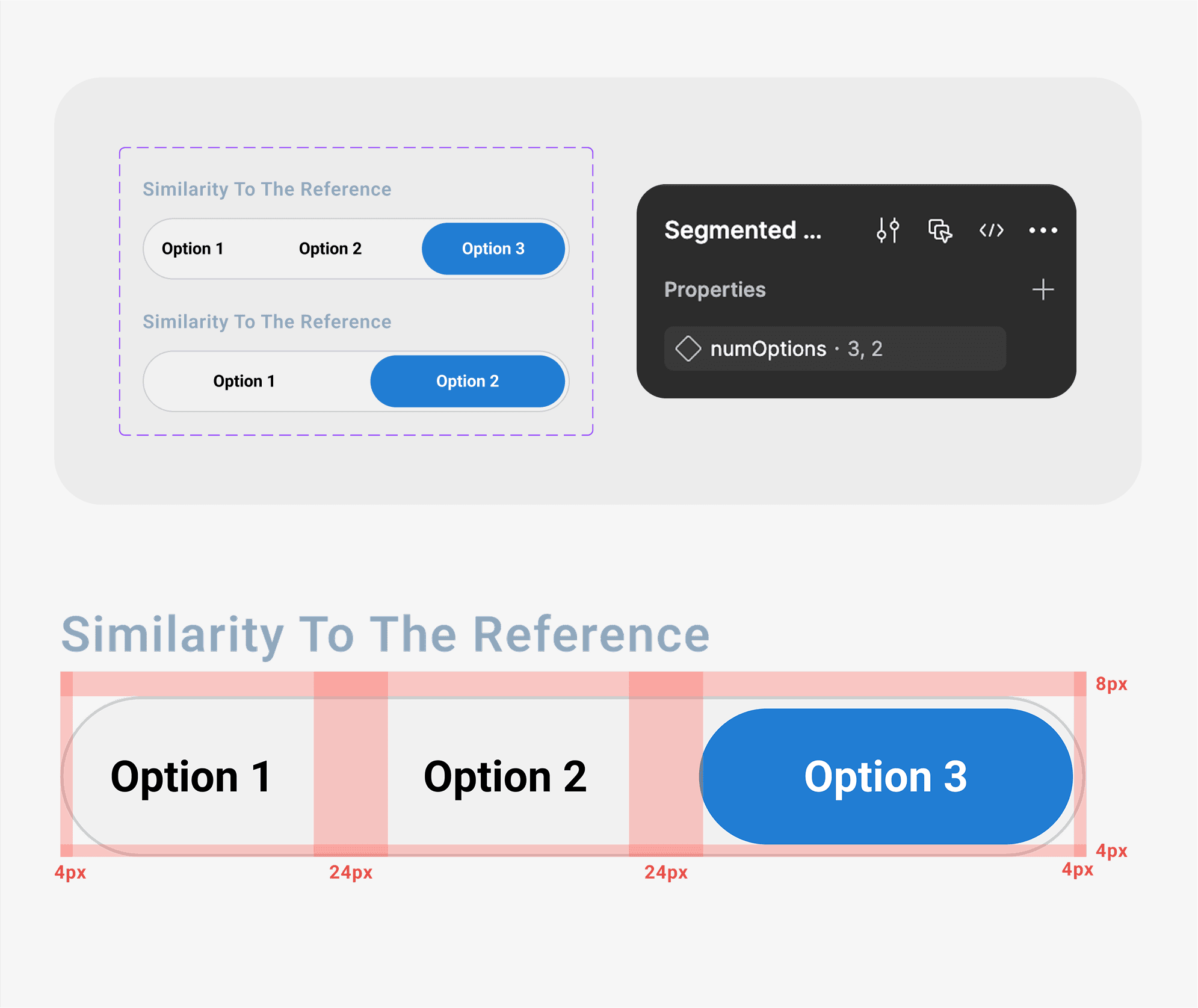
001
During internal usability testing, I realized that users adjusted the similarity slider 5 times on average before settling on a result, revealing its inefficiency.
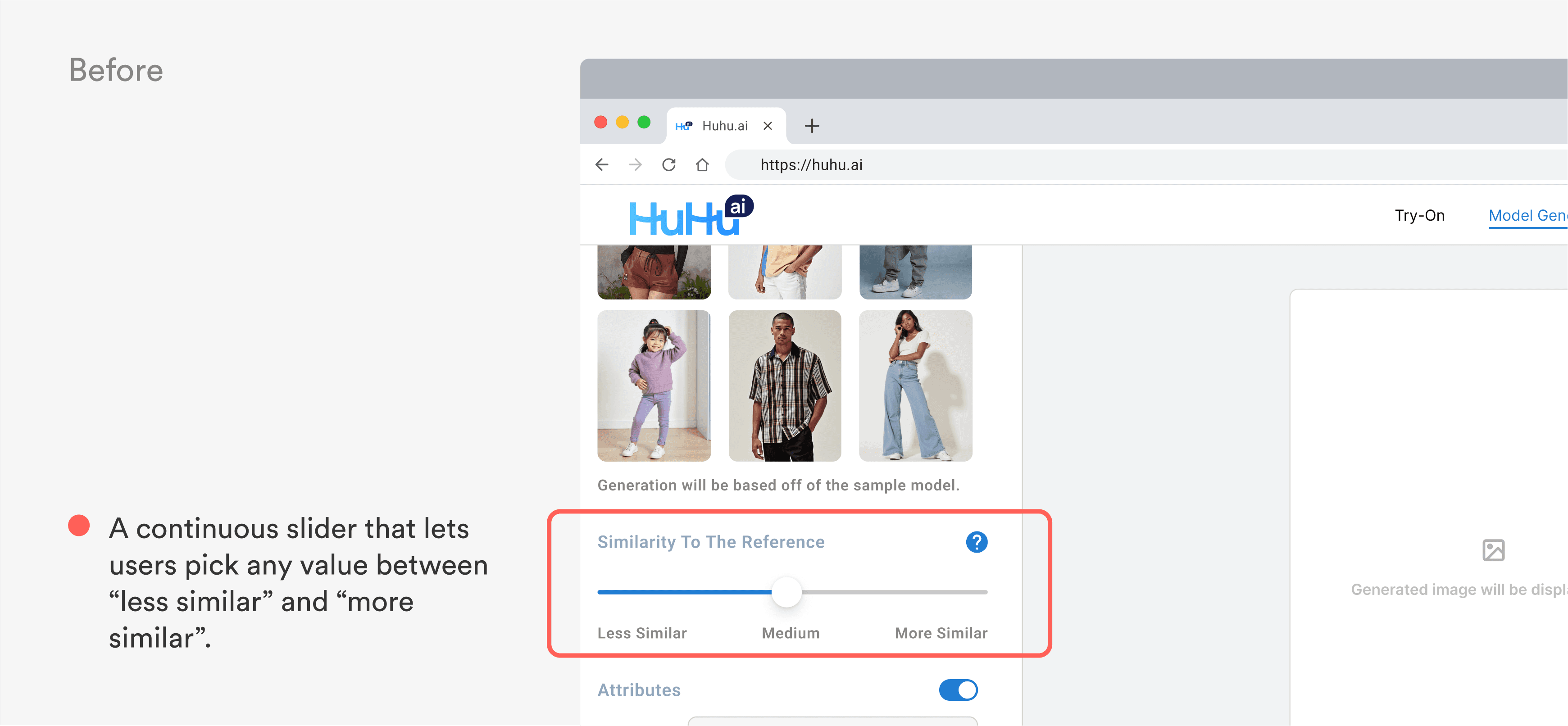
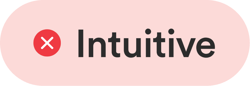
The slider wasn’t intuitive—users couldn’t easily grasp what each point represented or predict how small adjustments would impact the output, leading to uncertainty.

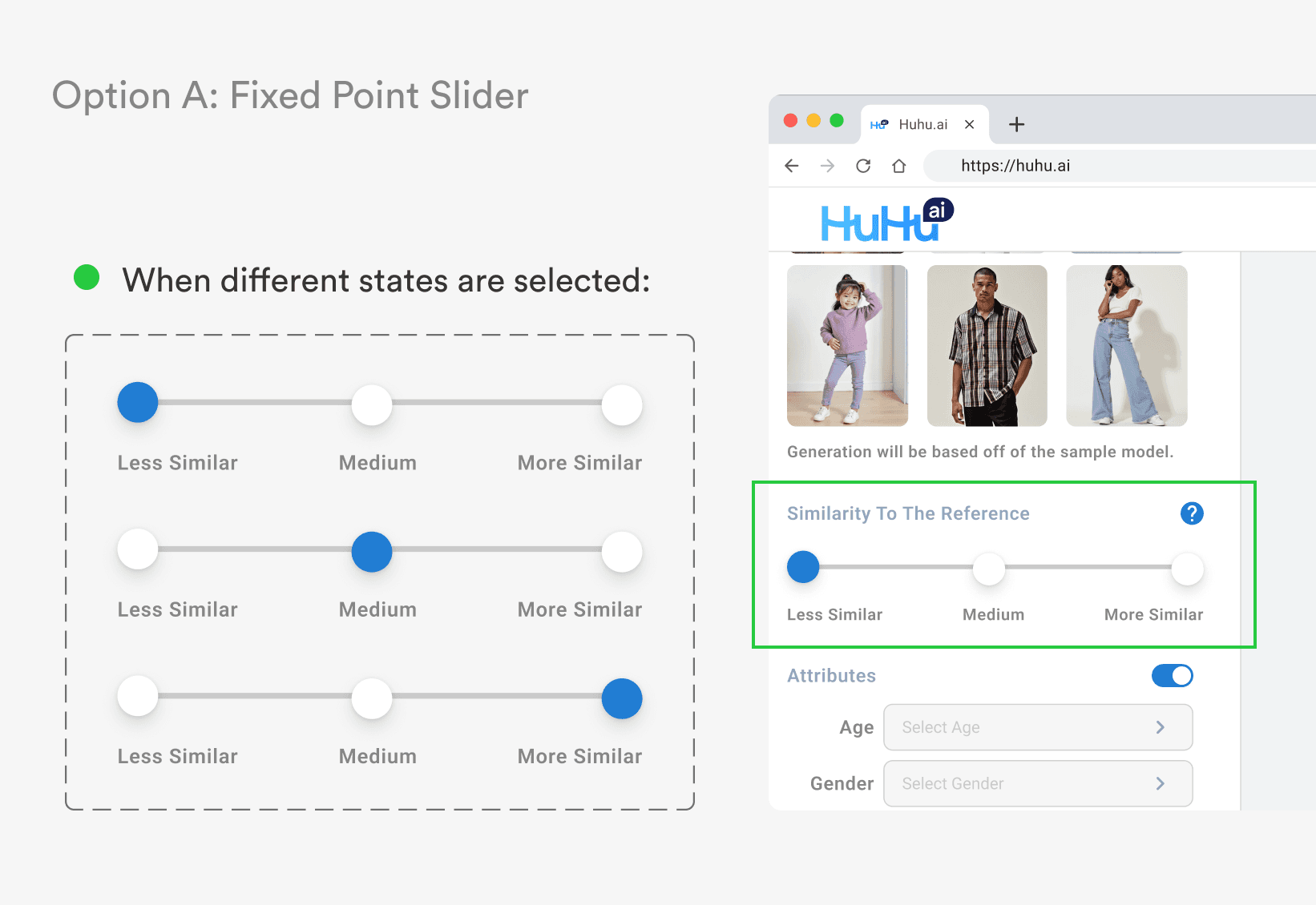

The fixed point slider offers clear, predefined selection points. However, it’s not entirely frictionless, as users might expect it to be draggable and feel frustrated when it doesn’t behave that way.

The segmented button group provides clear options without ambiguity and seamlessly integrates with the existing design system, ensuring a smoother implementation.
Before launch, I retested with the same users and reduced their average clicks to 2—resulting in a 60% faster image generation time.
002
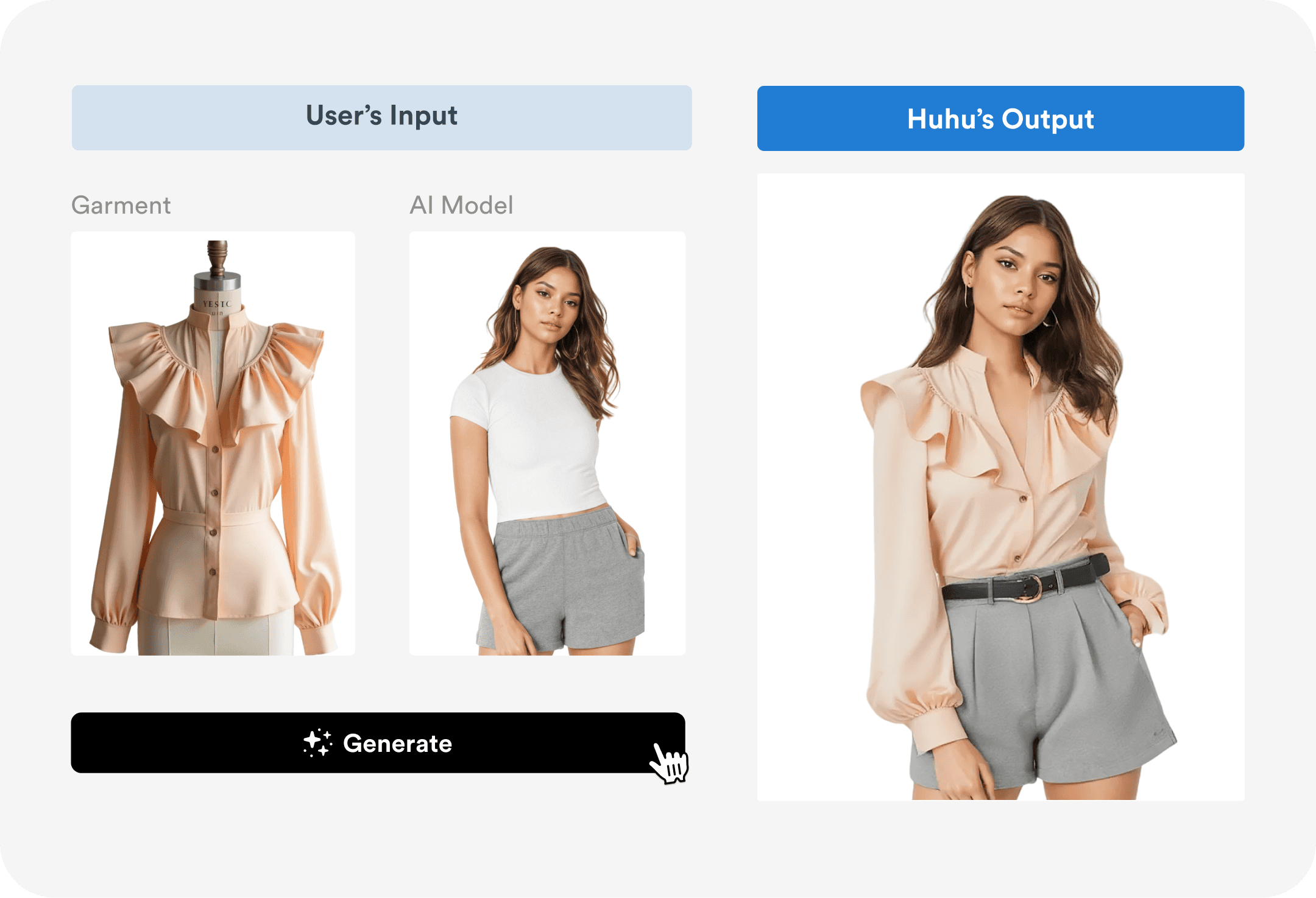
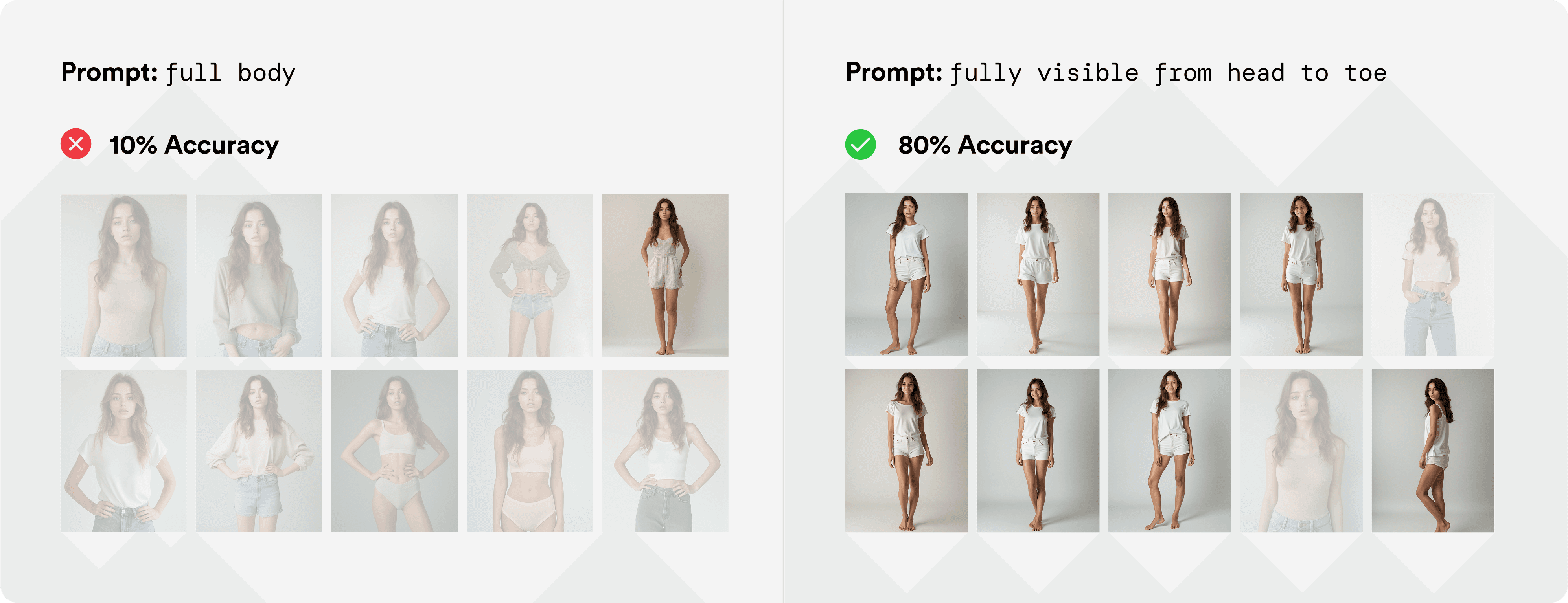
For example, using the prompt “full-body” felt intuitive but only worked 10% of the time, while a more literal phrase like “fully visible from head to toe” achieved 80% accuracy.
Instead of leaving users to guess the right words, what if I provided predefined options for common attributes like pose, gender, and background? This would significantly reduce the chances of poor results.
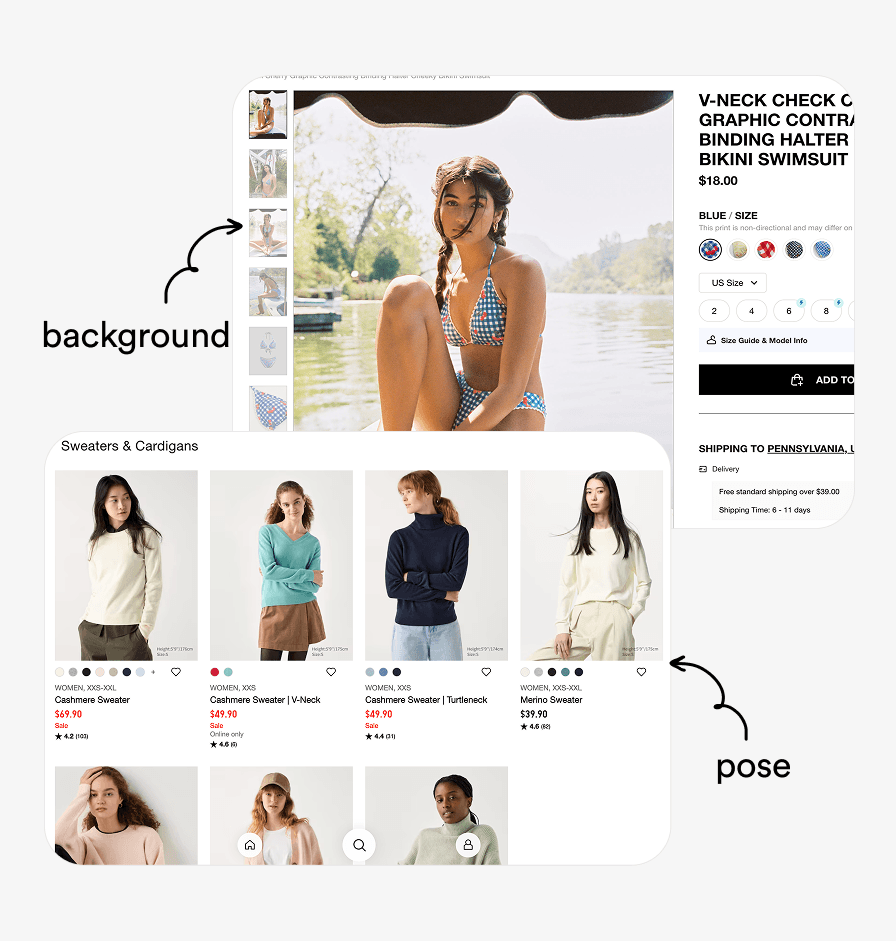
Market Research
I analyzed 6 fast fashion brands to identify common attributes users would likely want to customize.
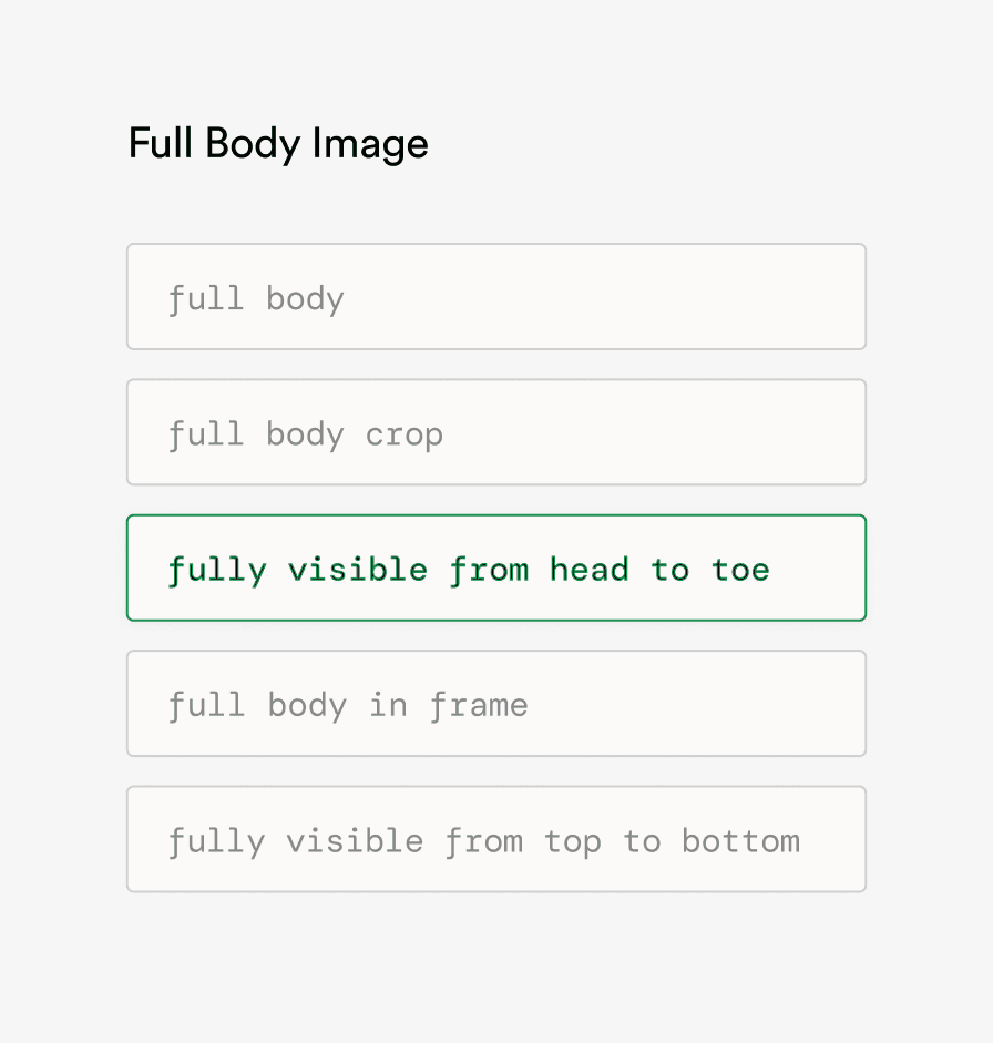
Fine-Tuning Prompt
For commonly seen attributes, I tested different prompt variations to see which consistently produced most accurate results.
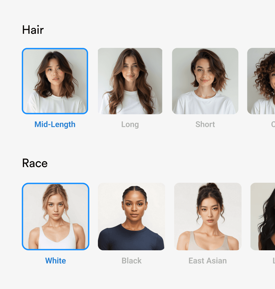
Exploring Visual
I also added visual examples to each saved attribute values, eliminating guesswork for users.
The prompt for all available options were carefully fine-tuned in the back-end, relieving users from concerns about suboptimal results due to poor prompting.
This design is intuitive because visual examples eliminate guesswork, allowing users to instantly understand each option without trial and error.
HANDOFF
Streamlined the handoff process for both front-end and back-end to ensure fast delivery.
001
I created detailed wireflows mapping all potential user behaviors across scenarios. With the product recently pivoted and no rigid design system in place, I built components as needed and provided thorough specs to ensure accurate implementation.
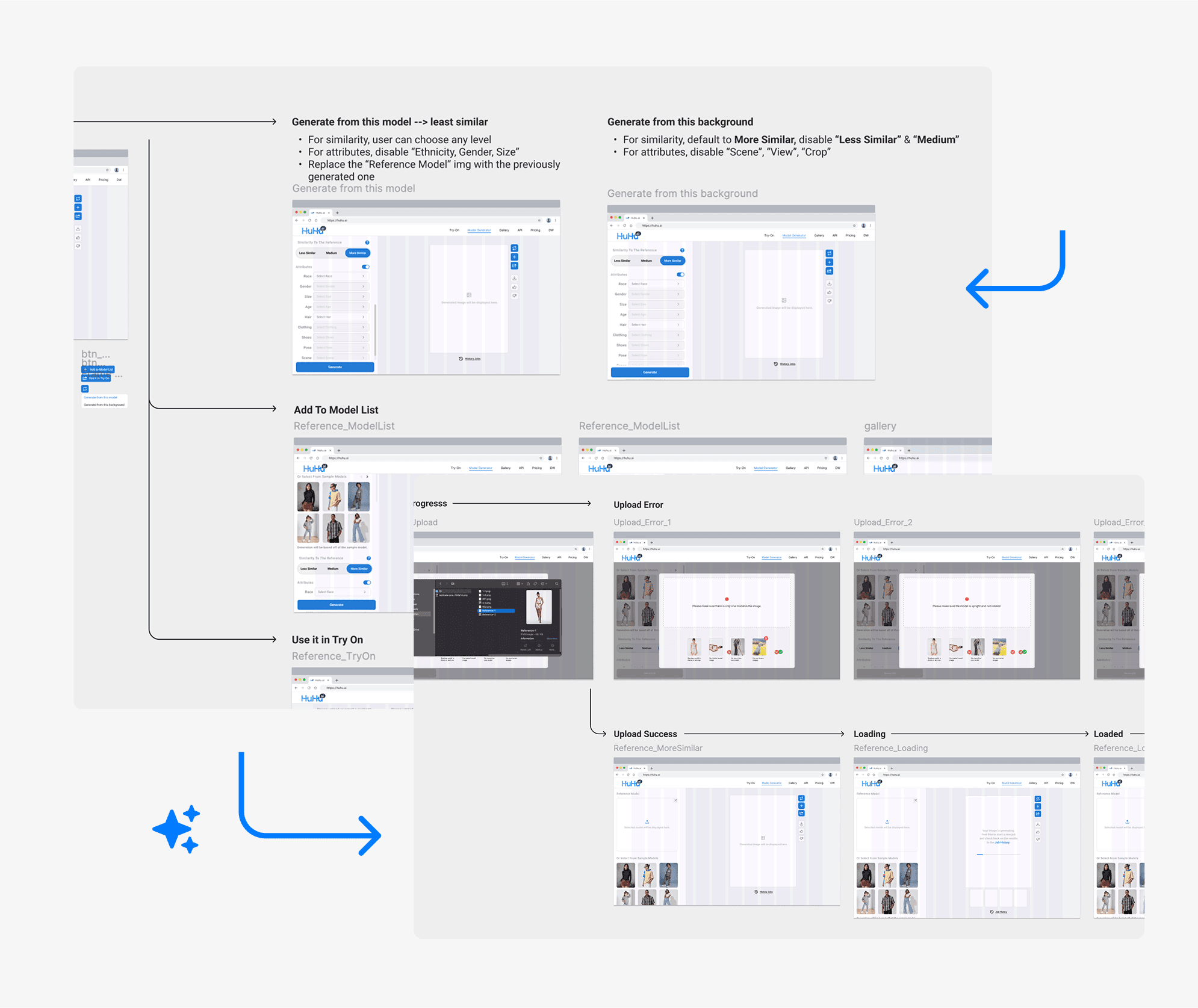
Wireflows
New DS Component & Specs
002
On the back-end, I tracked all prompted keywords and their corresponding values in a Google Sheet, with a status field for integration. I also created a pseudocode prompt template to ensure the system generated a workable prompt for any user-selected combination.
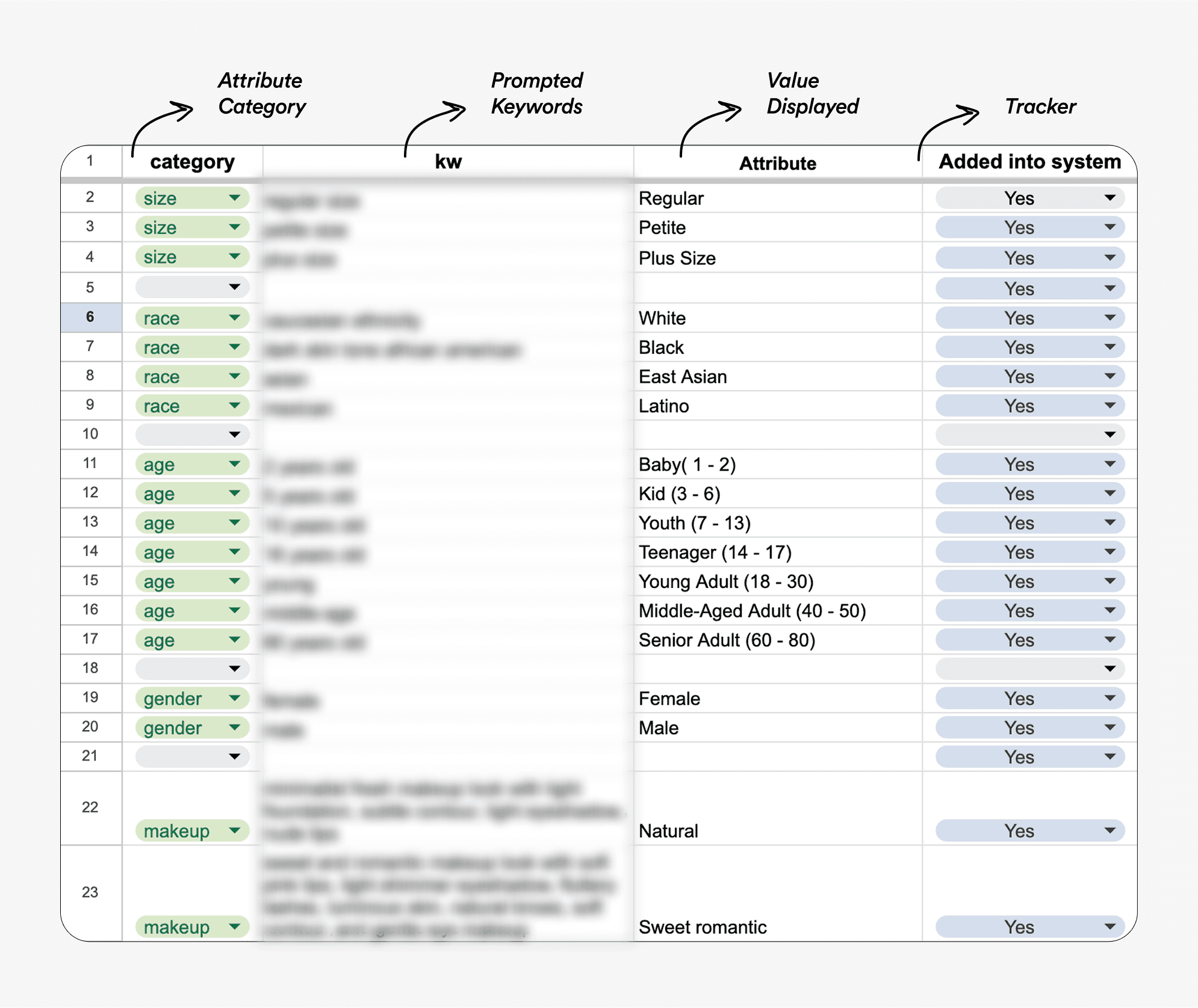
Keyword (Prompt) - Value Pair

Prompt Template Pseudocode
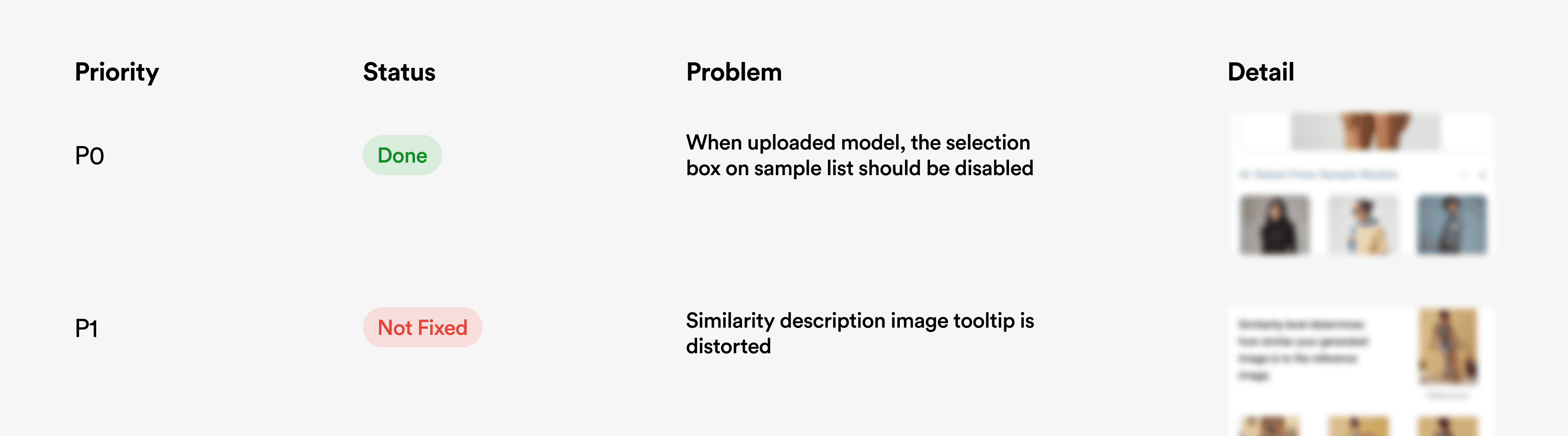
003
Once the design and development were complete, the product was launched internally. I facilitated the QA process, prioritizing high-impact bugs to ensure a smooth, error-free experience.