
OVERVIEW
Huhu Studio is a B2B SaaS platform that enables fashion brands to generate AI try-on images at scale. The platform supports bulk image generation, real-time project feedback loop, and an image gallery that allows clients to efficiently organize assets. By combining AI automation with thoughtful UX, Huhu Studio helps clients reduce manual overhead while maintaining brand consistency across visuals.
IMPACT
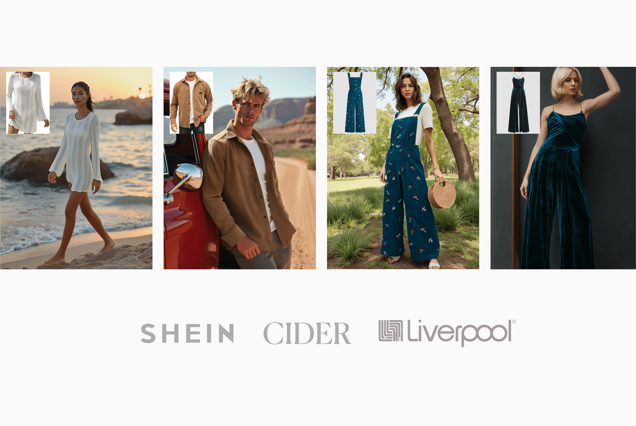
Actively serving global fashion brands including Cider, Liverpool, and Landmark, contributing to a total of 1M+ deal.
More Info ↗
👈 This web page was also designed by me!
MY ROLE
IC Product Designer
TEAM
2 Product Designers (incl. me)
1 Product Manager
1 UX Engineer
1 Front-End Engineer
1 Back-End Engineer
TIMELINE
Nov 2024 - Apr 2025
CONTEXT
Huhu AI helps enterprises generate AI virtual try-on images at scale.
The company was in the stage of pilot testing with global fashion brands such as Shein, Cider, and Liverpool, helping them generate AI fashion model and virtual try-on images tailored to each brand's specific SKU requirements and visual standards.
CHALLENGE
Excessive context switching slows monthly throughput.
However, each touchpoint requires switching between spreadsheets, AI image tools, and Figma—from organizing client feedback to generating and documenting images per SKU—leading to significant time lost in context switching and thus, non-scalable throughput.

PROBLEM STATEMENT
PROCESS
From MPV mapping to driving daily iterations.
My process was divided into two key phases: first, research and MVP mapping — digesting complex PRDs, identifying user needs, and outlining core user flows; second, rapid iteration — once the system has been implemented, I started working closely with developers to refine features and respond to evolving requirements. This approach ensured speed without compromising clarity or usability.

MY ROLE
Sole designer for Project Creation and Brand Management flows to lay the foundation for efficient service delivery.
I was responsible for the end-to-end design of two key user flows. The first enabled internal ops team members to seamlessly upload enterprise project requirements. The second allowed them to easily manage and review AI-generated fashion model images at a glance.
Project Creation Flow

Brand Management Flow
IMPACT
Designed and implemented the system in just 2 months, enabling Huhu to sign deals with larger scale.
Image Generation Throughput
Global brand deals secured
DEEP DIVE - PART ONE
001
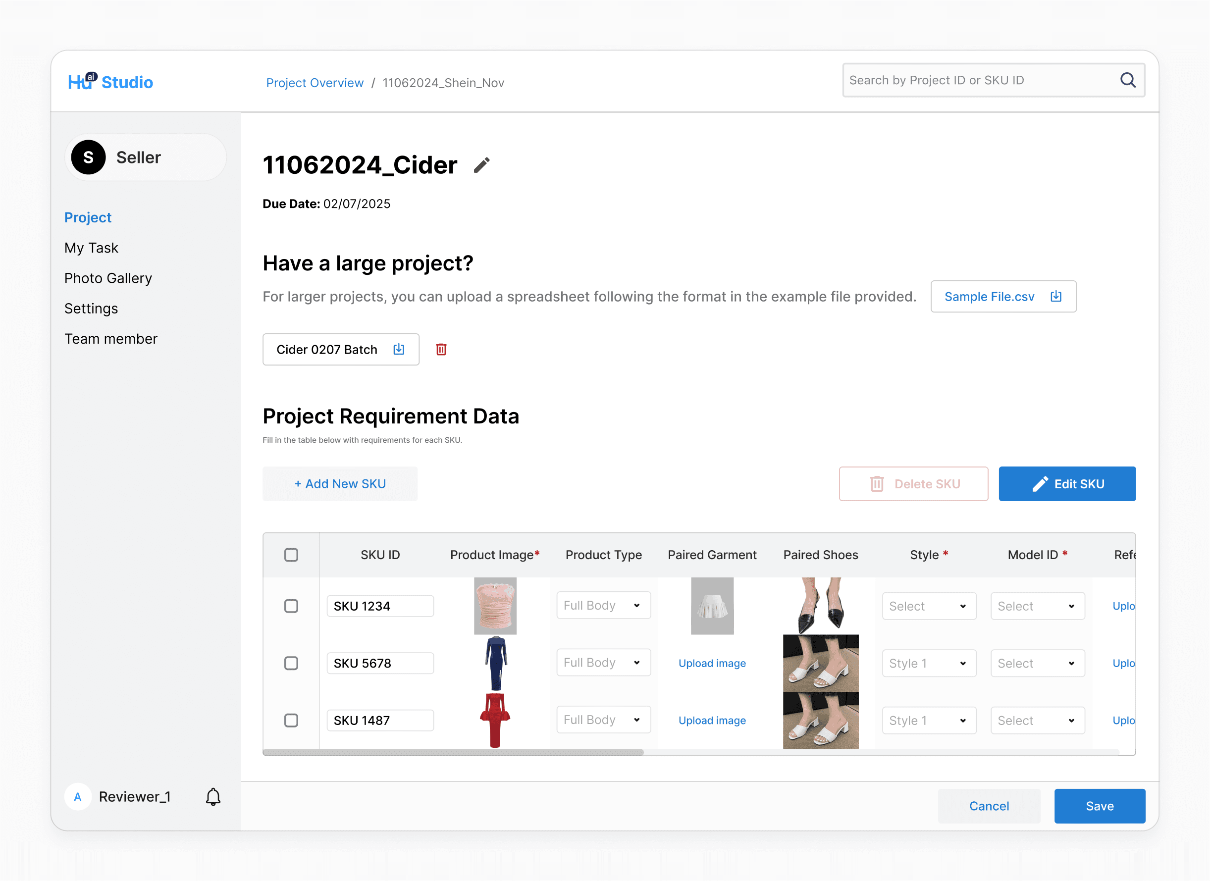
Project Input Via Spreadsheet Upload & Manual Input
Some large clients manage complex SKU requirements in spreadsheets, while SMBs often handle fewer SKUs per project. Supporting both spreadsheet uploads and manual input enabled us to meet the needs of both groups and integrate seamlessly into their workflows.
002
Manual Edit For More Sense Of Control
Clients' requirements often evolve after initial submission—such as adding new images or updating preferred models for specific SKUs. Providing manual edit options ensure that new information can be updated seamlessly.
Edit Text Fields
Edit Image Fields
003
Bulk Edit Multiple Rows At Once
Some fields are often consistent across multiple SKUs. To save users time and reduce repetitive input, I introduced a bulk edit feature that lets them update shared fields all at once.
004
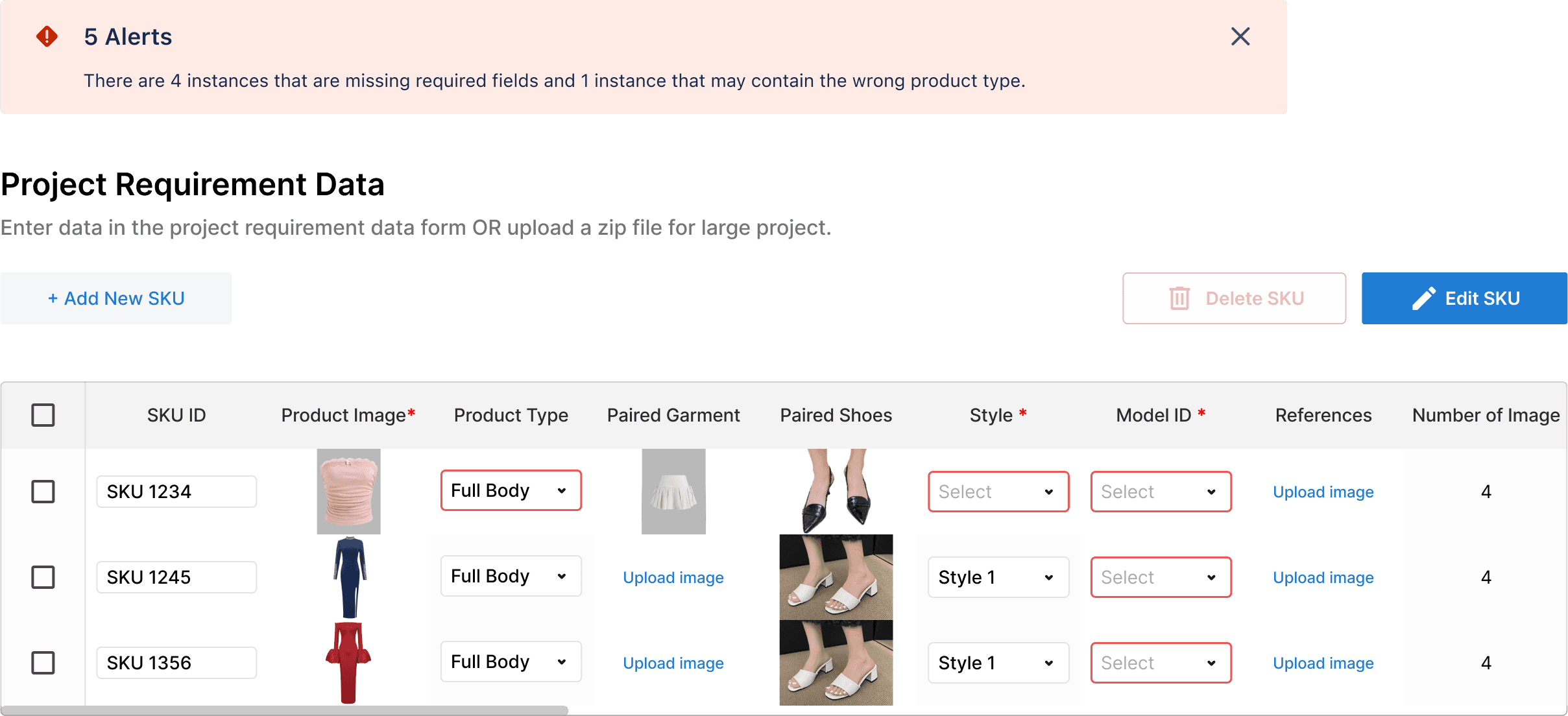
Clear Indication Of Erroneous Fields
To help users quickly identify and resolve input issues, I added a panel that summarizes the number + type of erroneous fields.
DESIGN DECISIONS
Designing in tandem with clients on both Content UX & usability.
Since we were building the platform while working with our initial customer, we had to learn by doing—adapting quickly to evolving client requirements was key. I iterated based on two main inputs: usability feedback to enhance the experience, and shifting client needs to stay aligned with their workflow.
001
The table columns were initially designed around one client’s specific needs. Over time, by analyzing more client behaviors, I identified common patterns. This allowed me to generalize the columns, refining the example spreadsheet format to better accommodate a wider range of clients requirements.
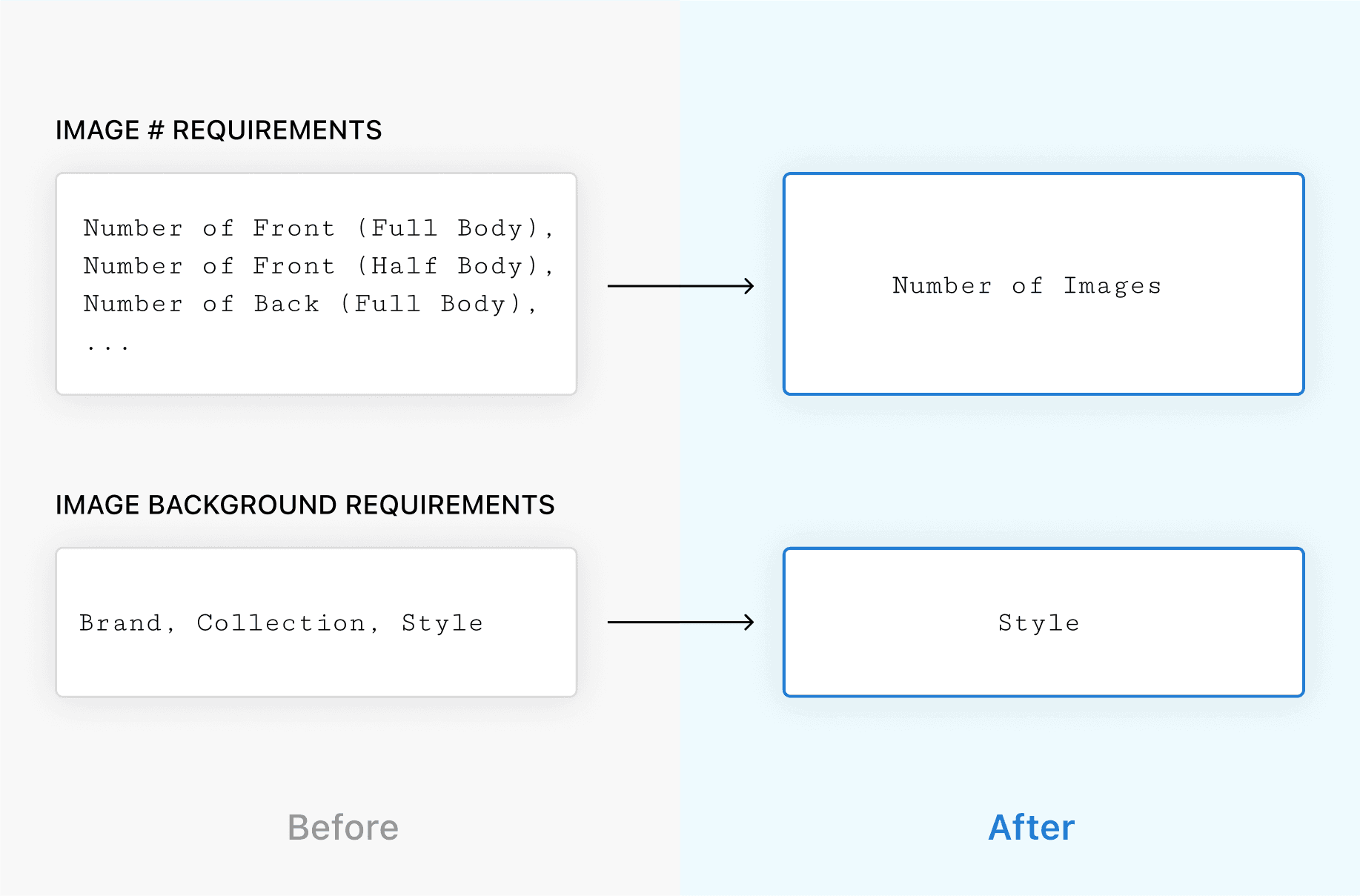
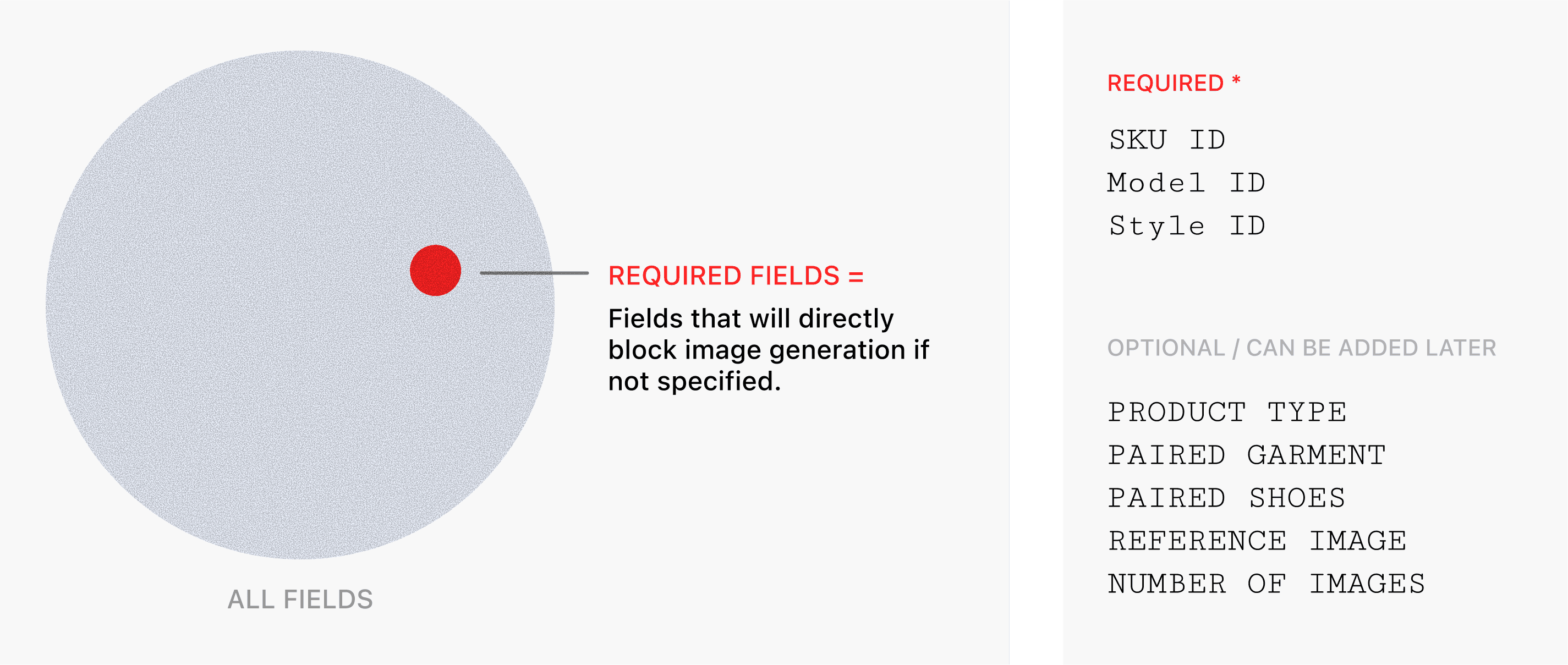
During testing, we discovered new columns like paired garment & shoes that could apply to other clients as well, so I added them as optional fields. Mandatory fields remain those will directly block progress if not specified at this stage.
002
I initially displayed all fields in bulk edit to give users full control, but it quickly became overwhelming and hard to scan.
💔 "I just wanna change one thing, but I have to scroll through all."
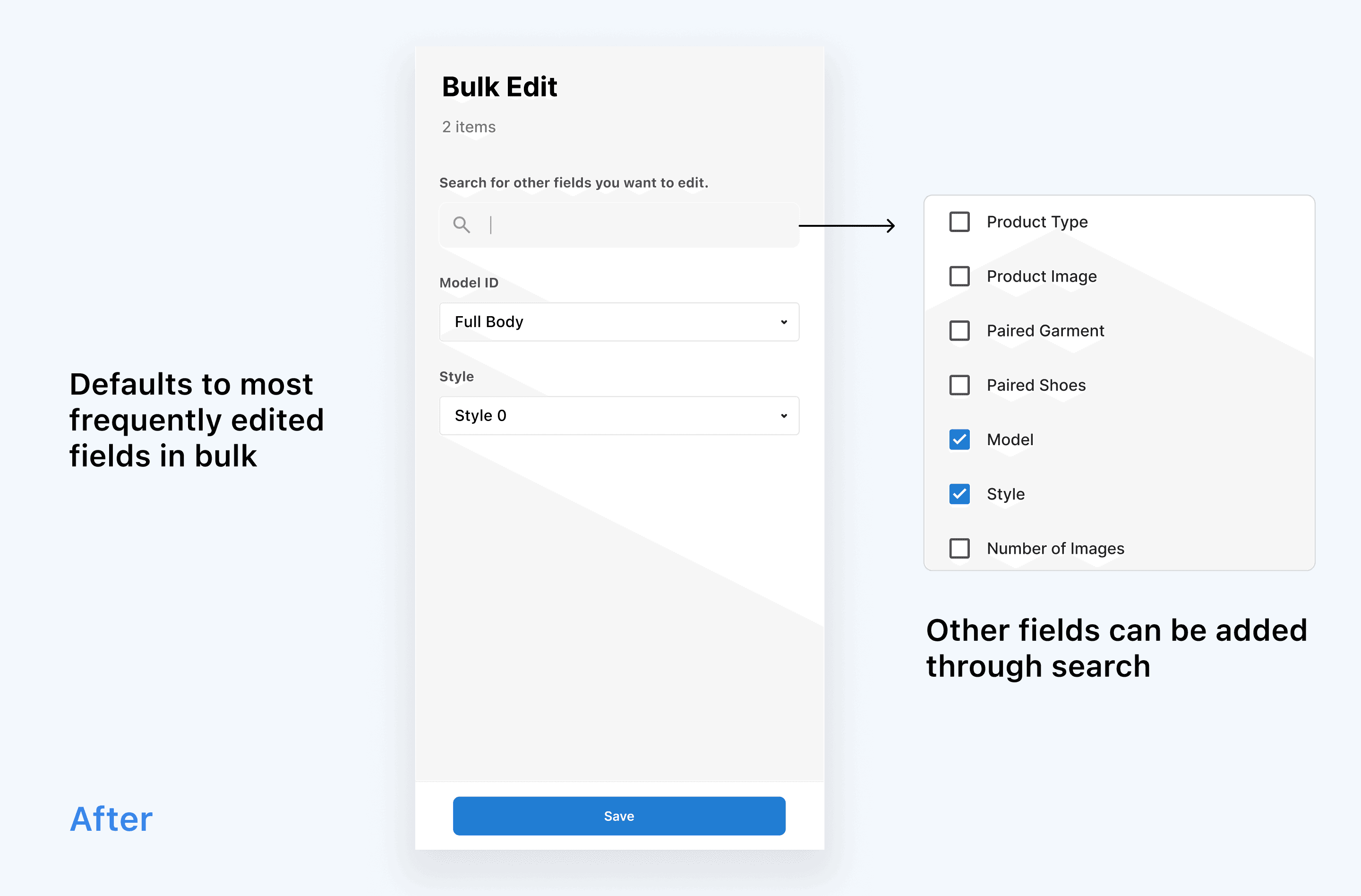
To improve usability, I switched to showing only the most frequently edited fields by default, with a search option to surface others as needed.
💚 "I like that it only shows the important stuff first!"
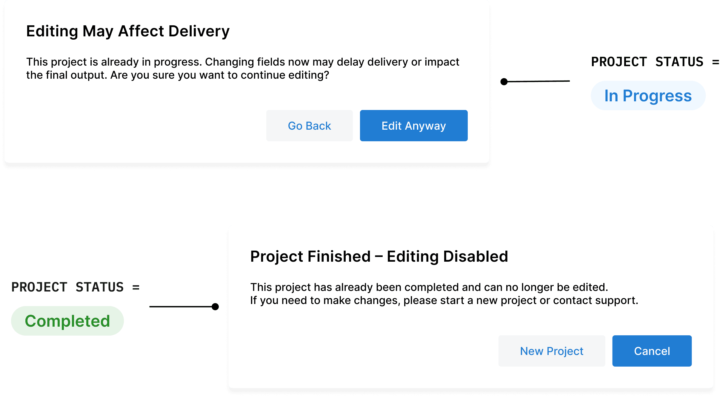
003
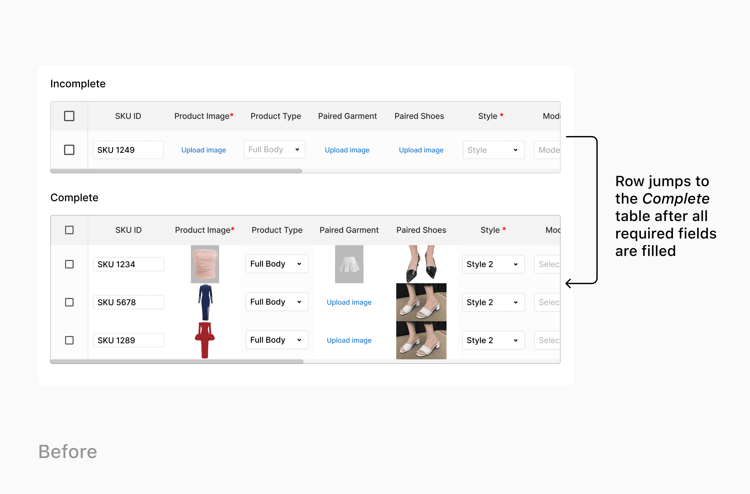
I initially separated the table into two sections to help users focus only on the one that needs editing. However, during testing, users found this disorienting. When a row was updated and moved to the other table, it disrupted their flow, especially in large projects.
💔 “I get lost when I fix something and it jumps away.”
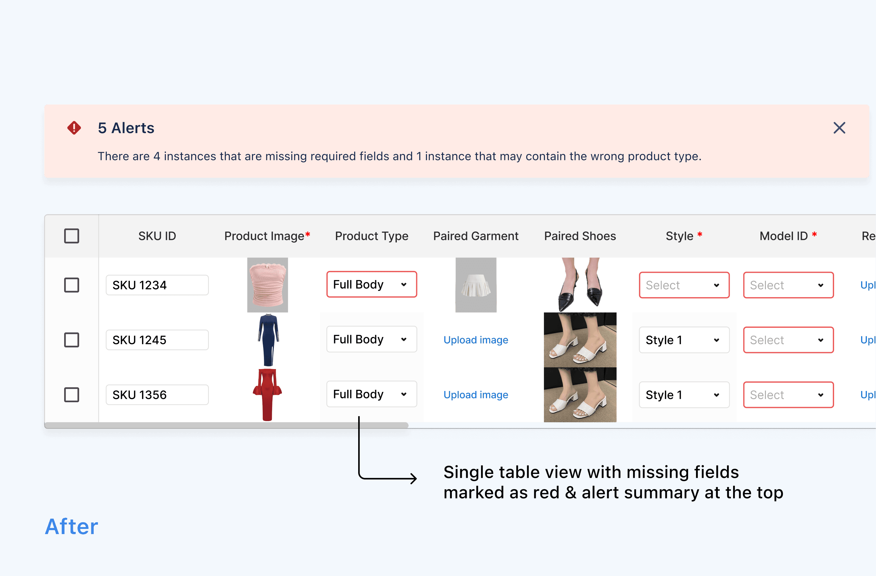
I redesigned the experience into a single unified table. Instead of separating rows, I used visual highlights to draw attention to fields that still needed input.
💚 "I like seeing everything in one place—it feels more stable."
DEEP DIVE - PART TWO
001
Filter Design For Quick Sorting
By default, fashion model images in the gallery are organized using two key attributes: Model & Style which are the most commonly used by our users. For more tailored browsing, an advanced search option allows users to apply additional filters and specify values.
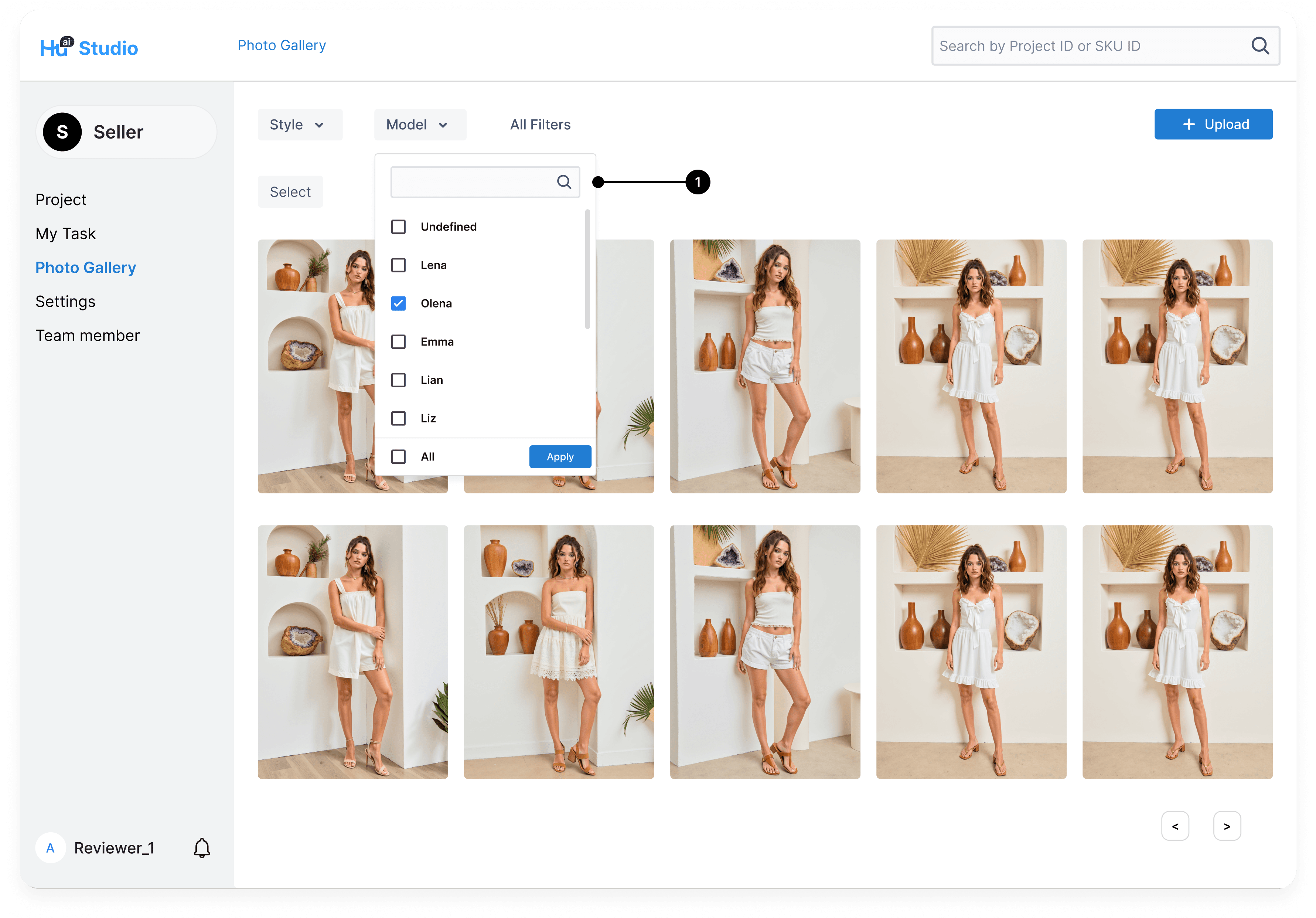

Dropdown with values, coupled with search bar + apply all option
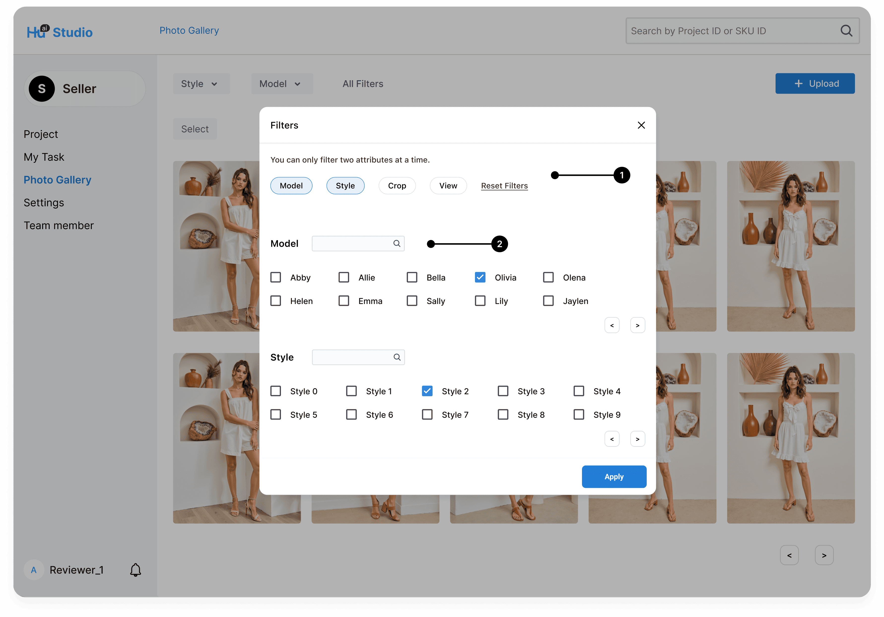
All available attributes to filter

Selected attributes & values, with pagination and search bar
DESIGN DECISIONS
Iterating over concept hierarchy & usability.
I refined the brand management flow by prioritizing frequently used filters, introducing a clean attribute-value structure, and adding pagination and advanced search. These updates streamlined navigation and made asset discovery faster and more intuitive for users.
001
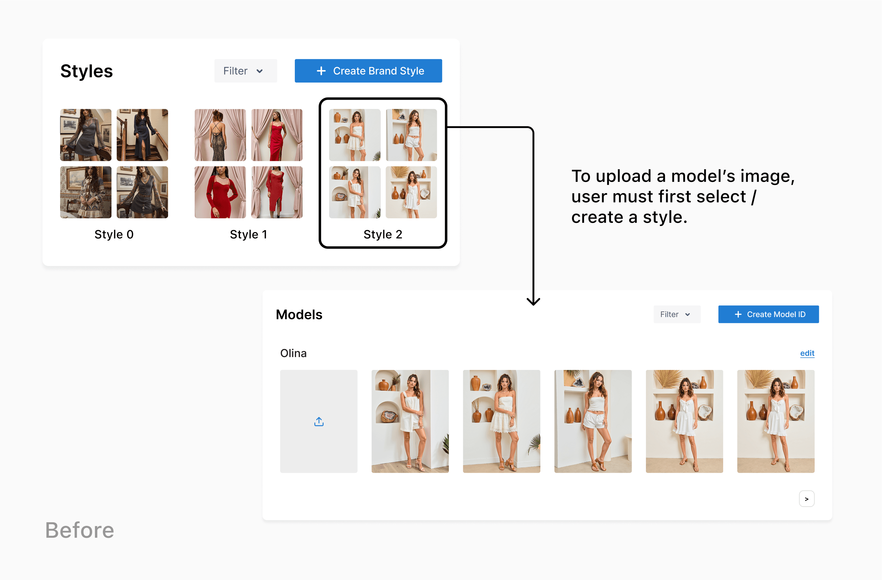
I initially designed the gallery with a top-down relationship, where Style acted as the parent category and Model was nested beneath it. This rigid hierarchy led to repetitive work when wanting to upload images.
💔 "Why can’t I just search by the model I need?."
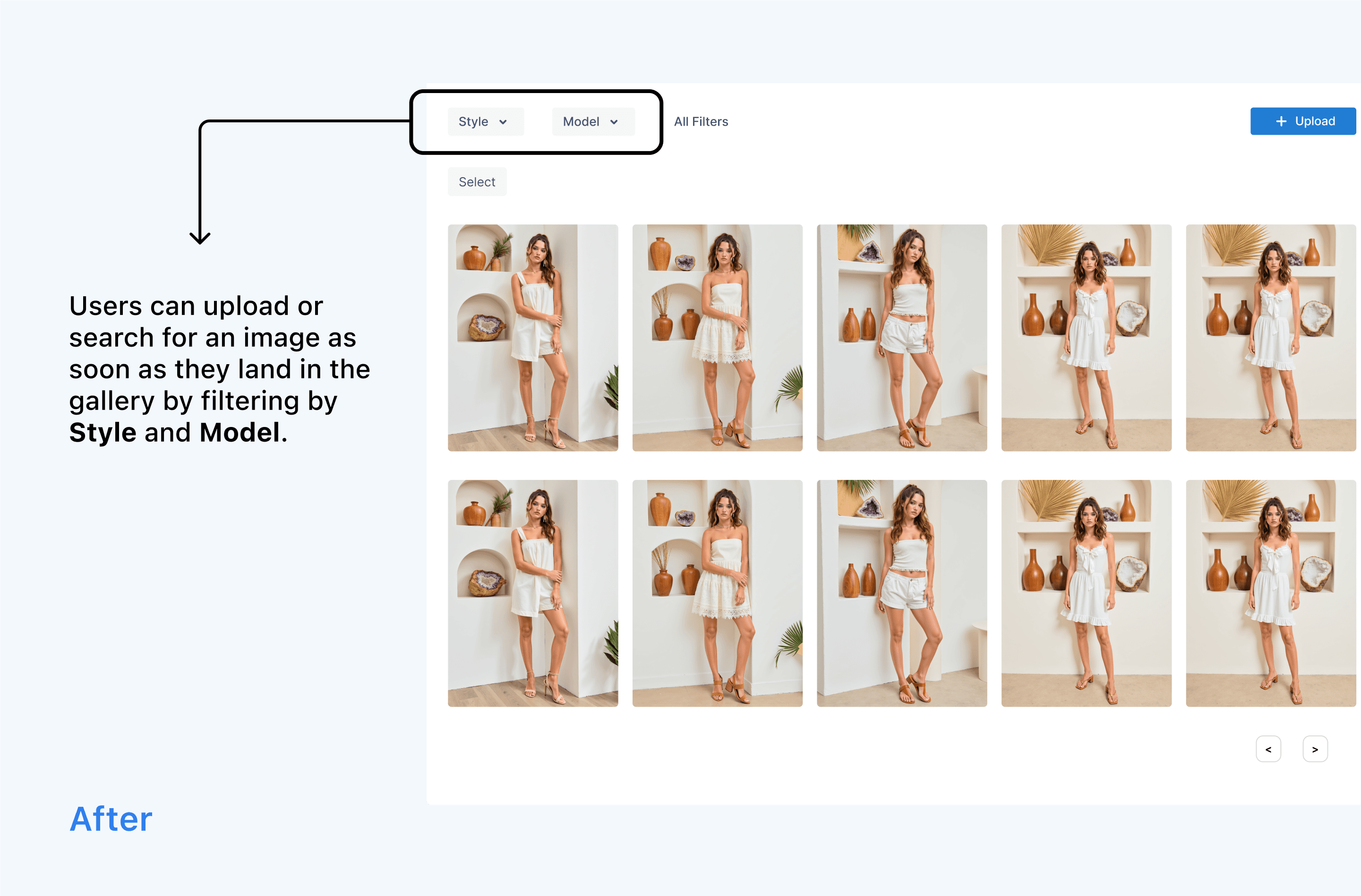
I restructured the flow so that Style and Model now exist on equal footing, allowing users to filter by either attribute independently. This update made navigation more flexible and intuitive.
💚 "Much easier to to find / upload images now!"
002
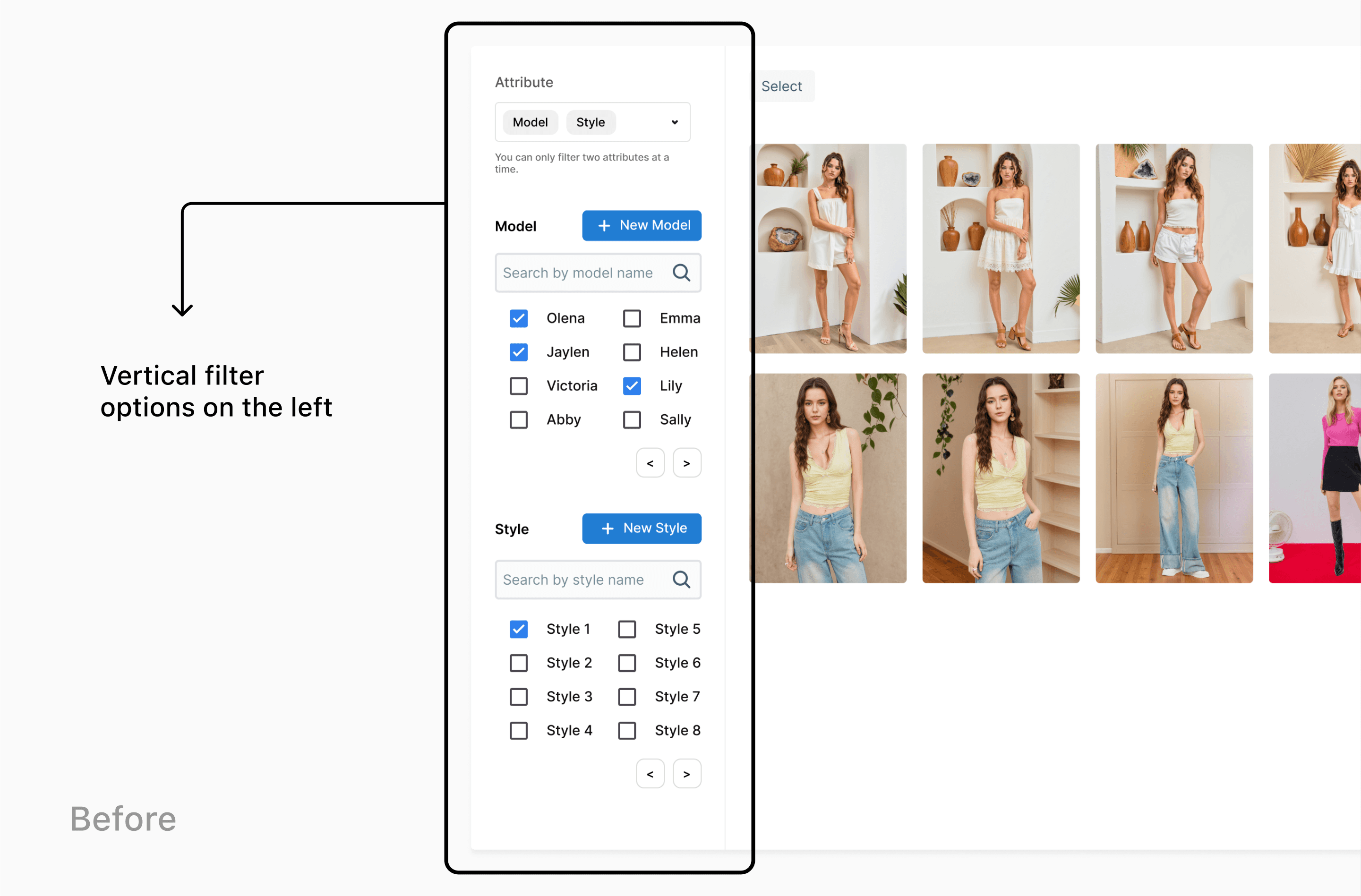
I first designed the filter as a vertical panel with two commonly used attributes fully expanded. While it gave users quick access, it often felt visually cluttered.
💔 "I like how the values are displayed already, but it’s a bit much when I’m viewing all the model images on the side.”
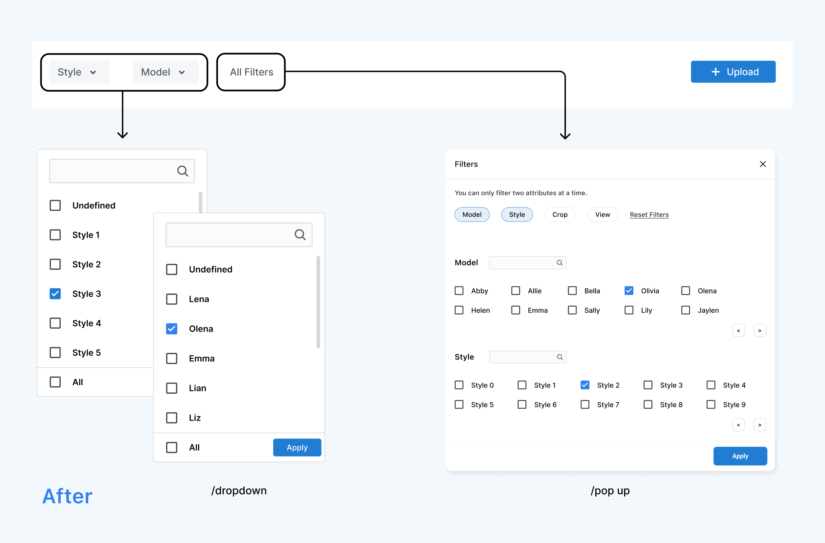
To improve focus, I switched to dropdowns for the top two attributes. Users still get quick access, but with less noise. Additional filters are available within the dropdown for deeper refinement
💚 "Much cleaner and still easy to use.”