
OVERVIEW
Cura is a mobile app developed in partnership with University Hospitals’ Wound Care Center to support skin cancer patients recovering from Mohs surgery. It aims to provide clear, empathetic post-operative care through both proactive and responsive features—from a personalized wound care calendar to an AI-powered call system offering 24/7 answers and triage support.
IMPACT
77.8% perceived willingness to use the app
Demo ↗
MY ROLE
Lead Product Designer - AI Voice Call Feature
& Design Systems
TEAM
2 Product Designers (incl. me)
2 UX Researcher
1 Project Manager
TIMELINE
Jan - Aug 2024
PROBLEM
From clinic clarity to home uncertainty.
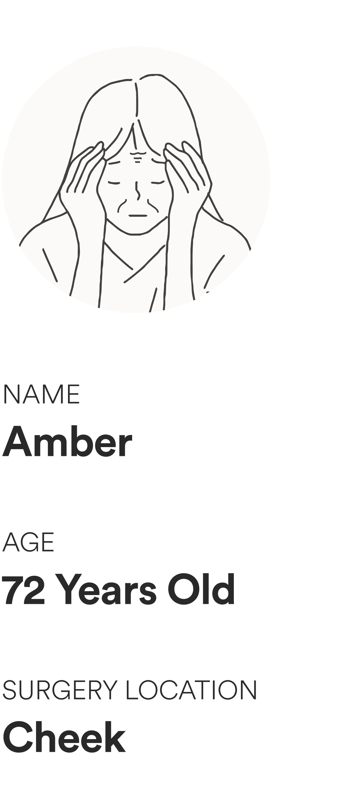
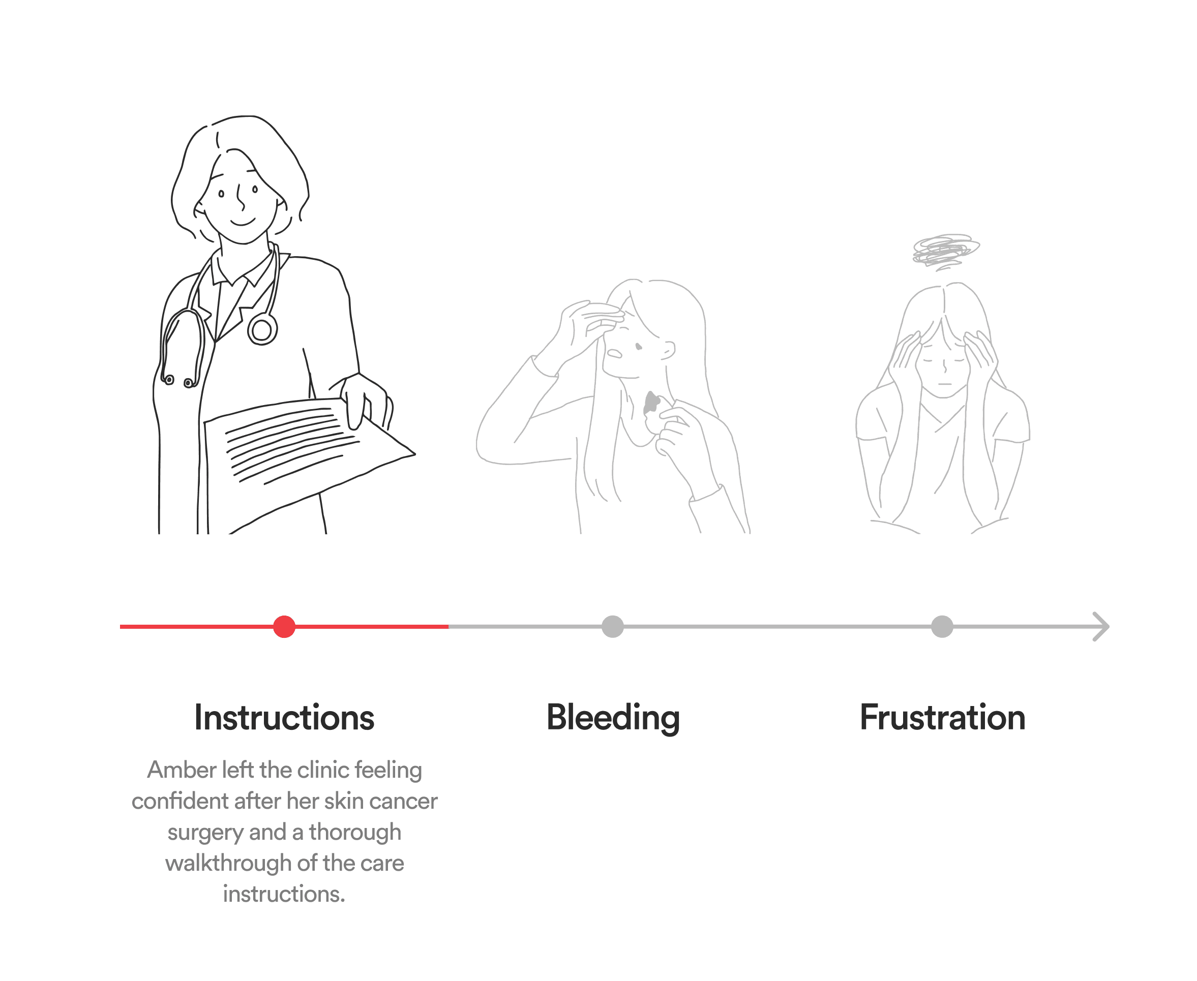
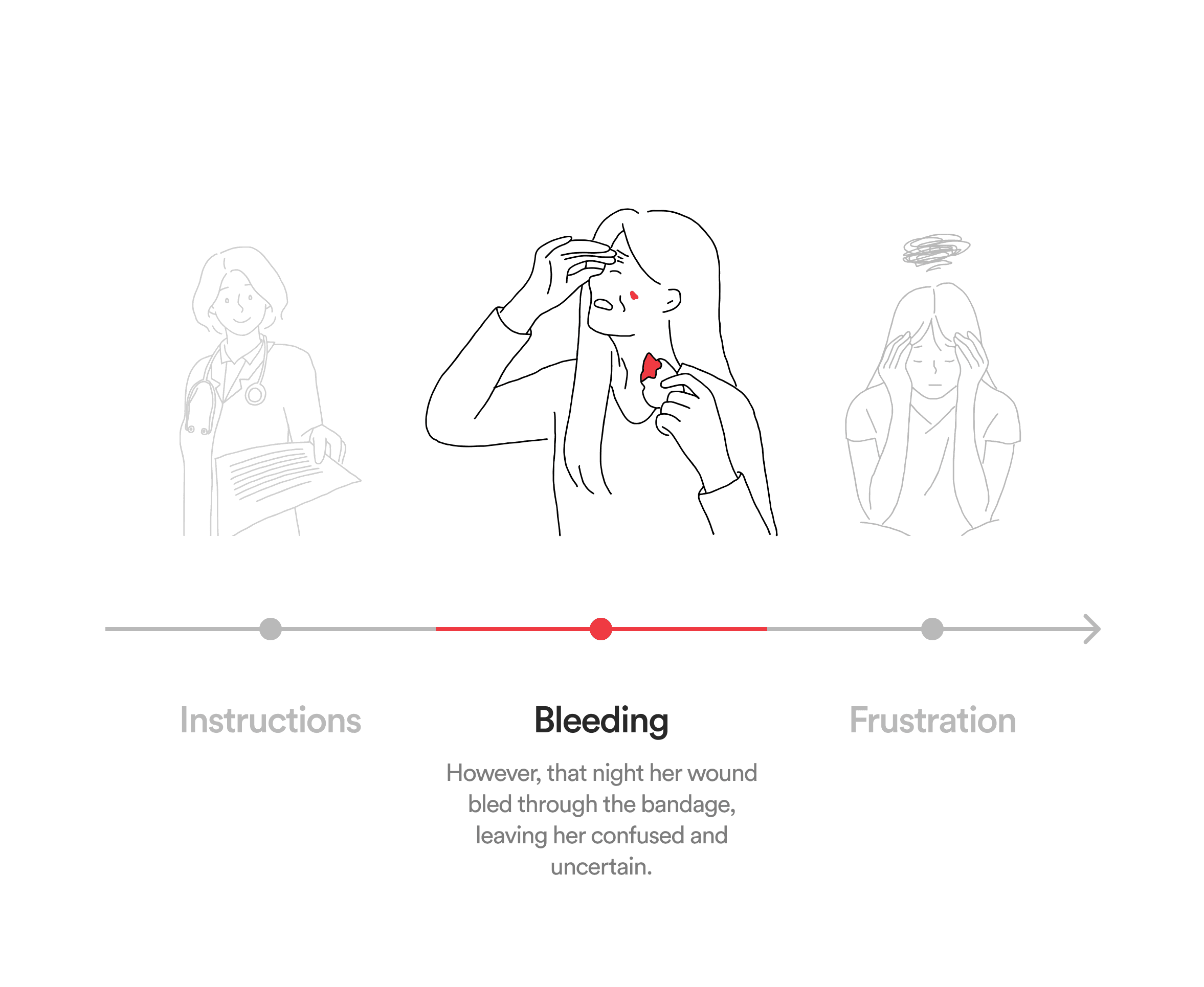
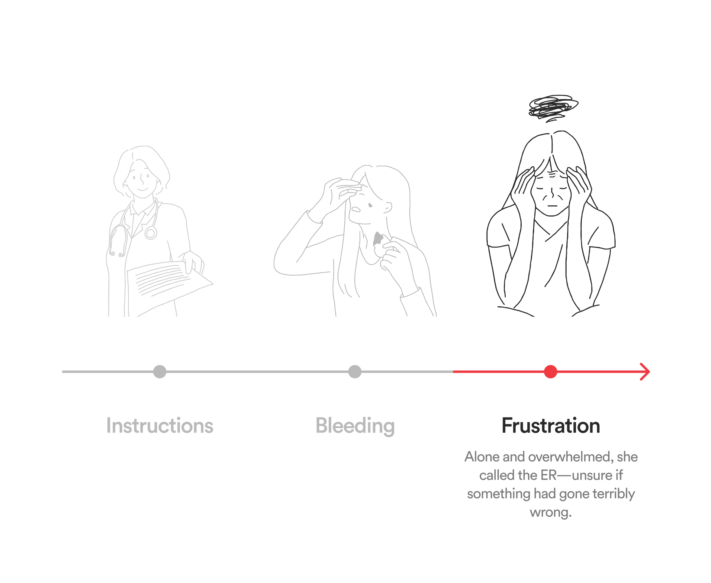
Meet Amber, a 72-year-old woman recovering from skin cancer surgery. She left the clinic feeling confident—until that night, when her wound bled through the bandage. Alone and overwhelmed, she faced a critical moment with no support, exposing the gap between clinical instructions and real-life recovery.
In the U.S., Mohs surgery is performed over 900,000 times each year. Without proper wound care, recovery can be delayed and complications can arise.
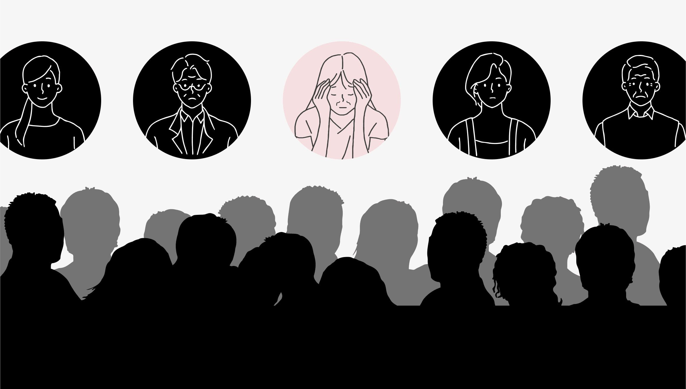
Amber's Story Extends Beyond The Clinic
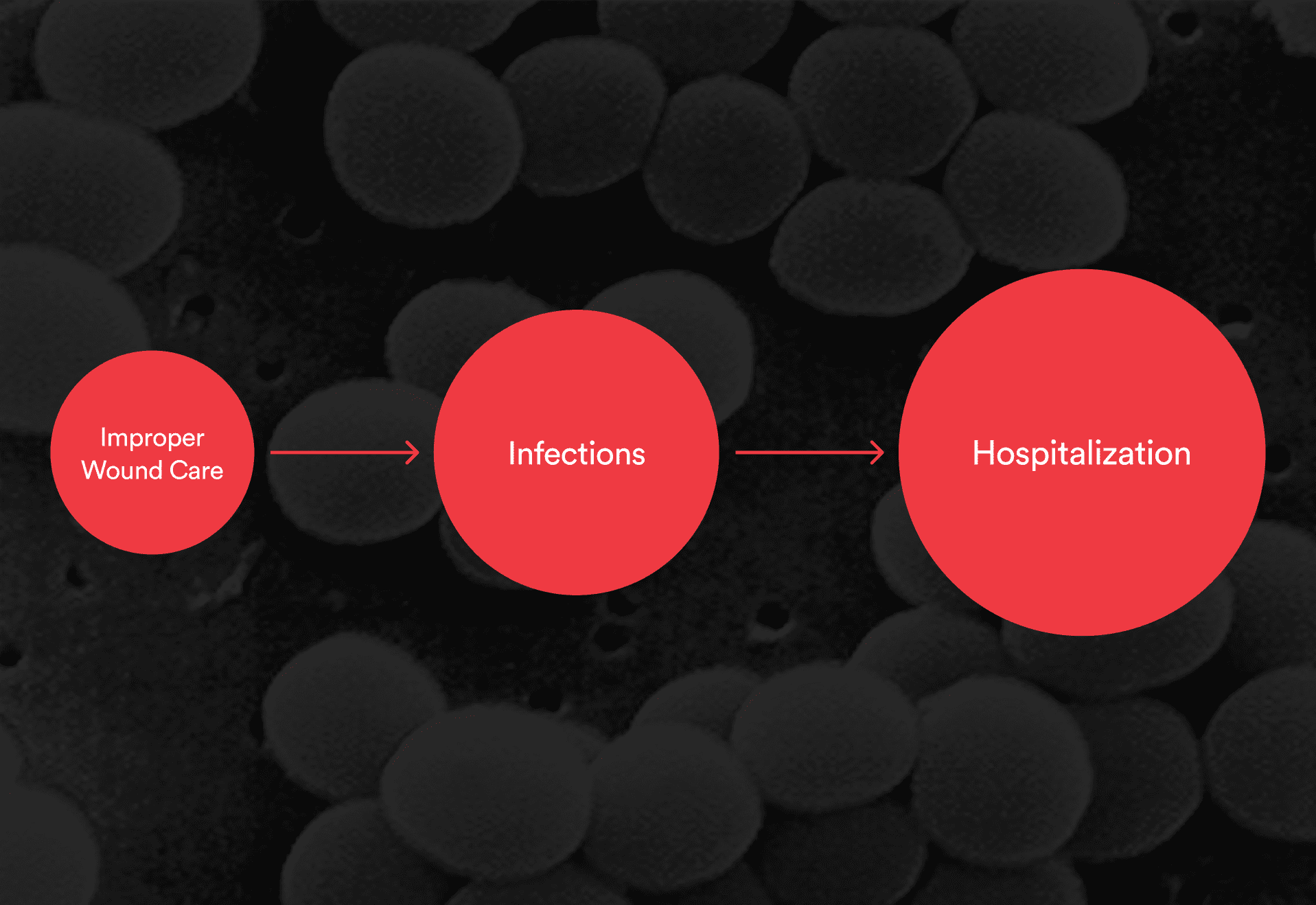
Consequences of Improper Wound Care
KEY PAIN POINTS
What 3 months of research boiled down to.
After three months of in-depth research through contextual inquiry and user interview, the team identified two key pain points with the current wound care experience.
001
The current wound care procedure doesn’t feel personalized beyond the clinic.
Patients often receive the same standardized 4-page care guide, which can feel impersonal and insufficient—making it hard to stay engaged during recovery.
002
Patients are unprepared when unexpected situations arise.
Nurse interviews revealed that even confident patients often feel unprepared and anxious when complications arise at home.
SOLUTION FRAMEWORK
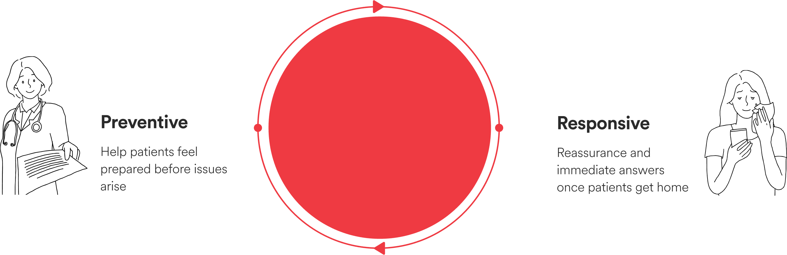
From preventive to responsive.
To address these challenges, I developed a preventive-to-responsive framework—one that equips patients before problems arise, and supports them in real time when they do. This framework became the foundation for Cura, a mobile app designed to help patients like Amber feel informed and supported throughout their wound care journey.
MY RESPONSIBILITY
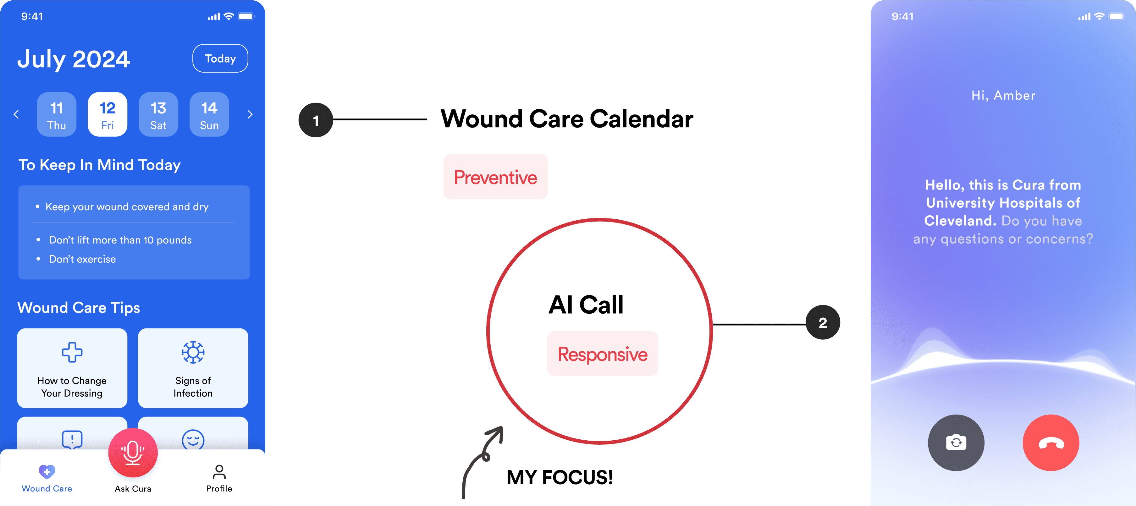
Focusing on empowering patients from a responsive perspective—supporting them after issues arise.
To address these challenges, the team decided to design a mobile app with two core features: a personalized wound care calendar for daily preventive guidance, and a responsive AI call feature that offers instant support and escalates serious issues to the clinic. I led the end-to-end design and testing of the AI call feature, focusing on creating a seamless and trustworthy user experience.
PROBLEM STATEMENT
How might we ensure patients receive immediate answers and reassurance while reducing the workload for nurses?
IMPACT
Received positive user feedback during testing.
Task Success Rate
82%
Perceived Willingness To Use The App
+77.8%
SOLUTION
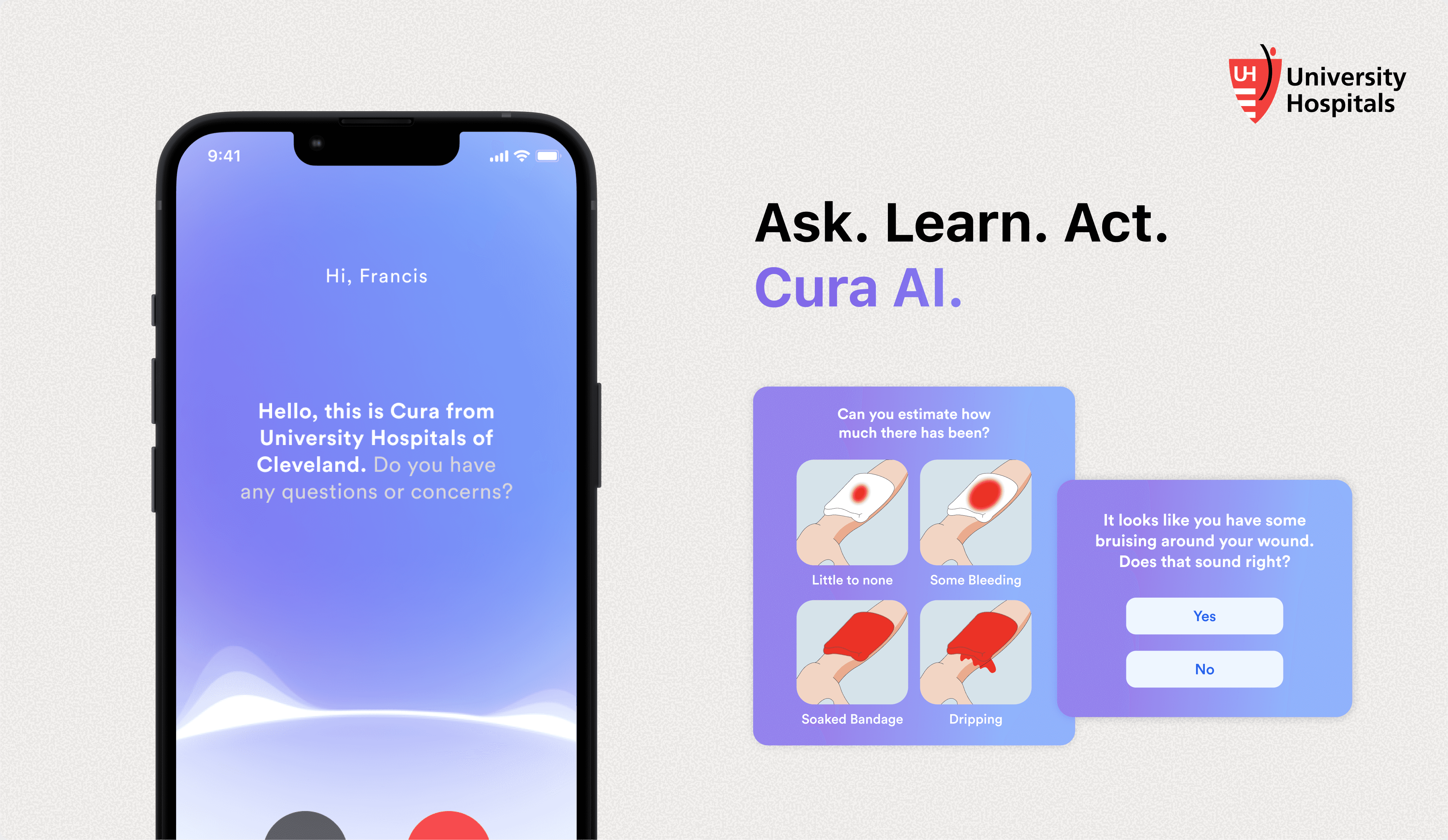
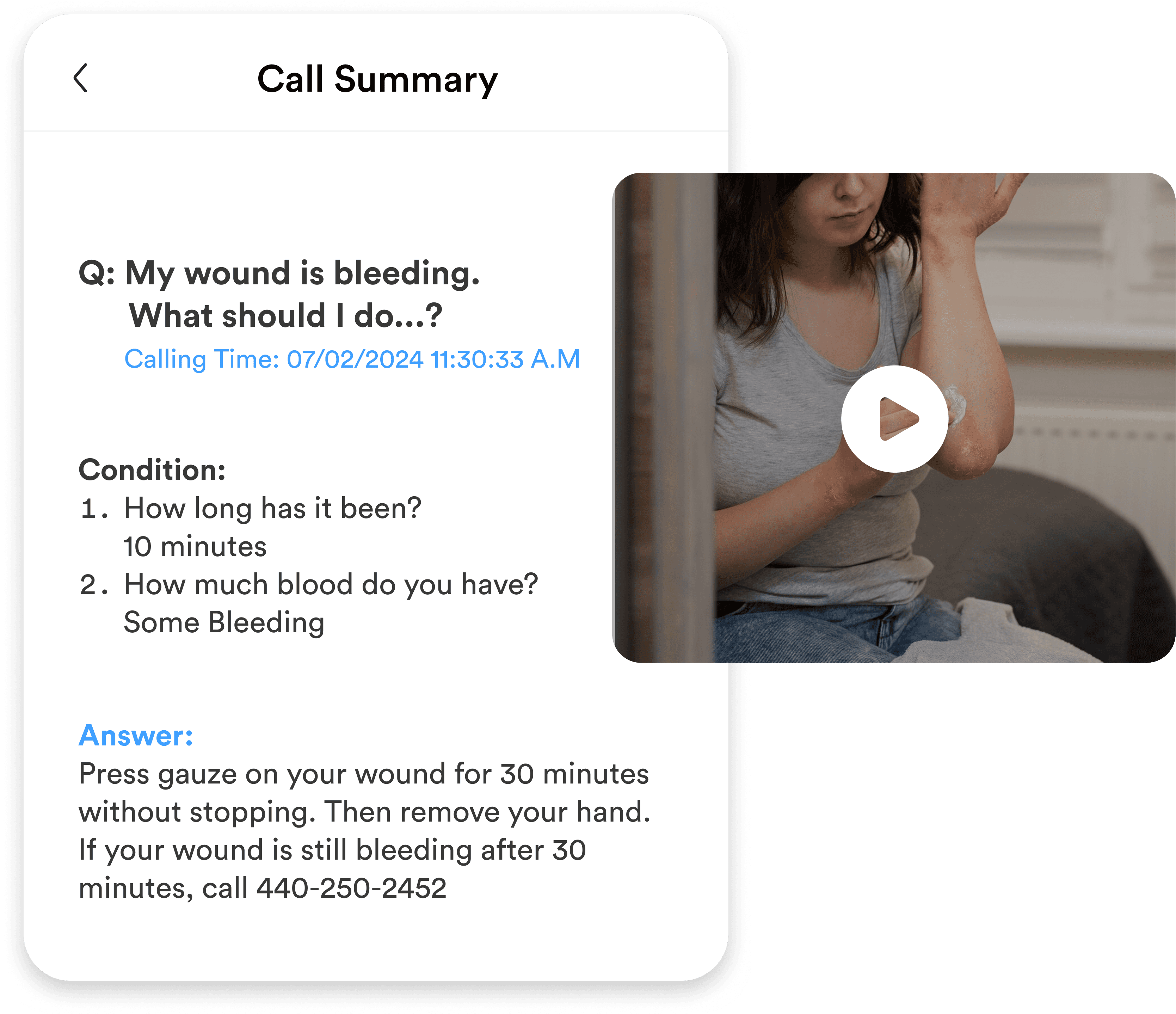
Patients can either speak directly with Cura or upload a picture to help AI analyze their situation.
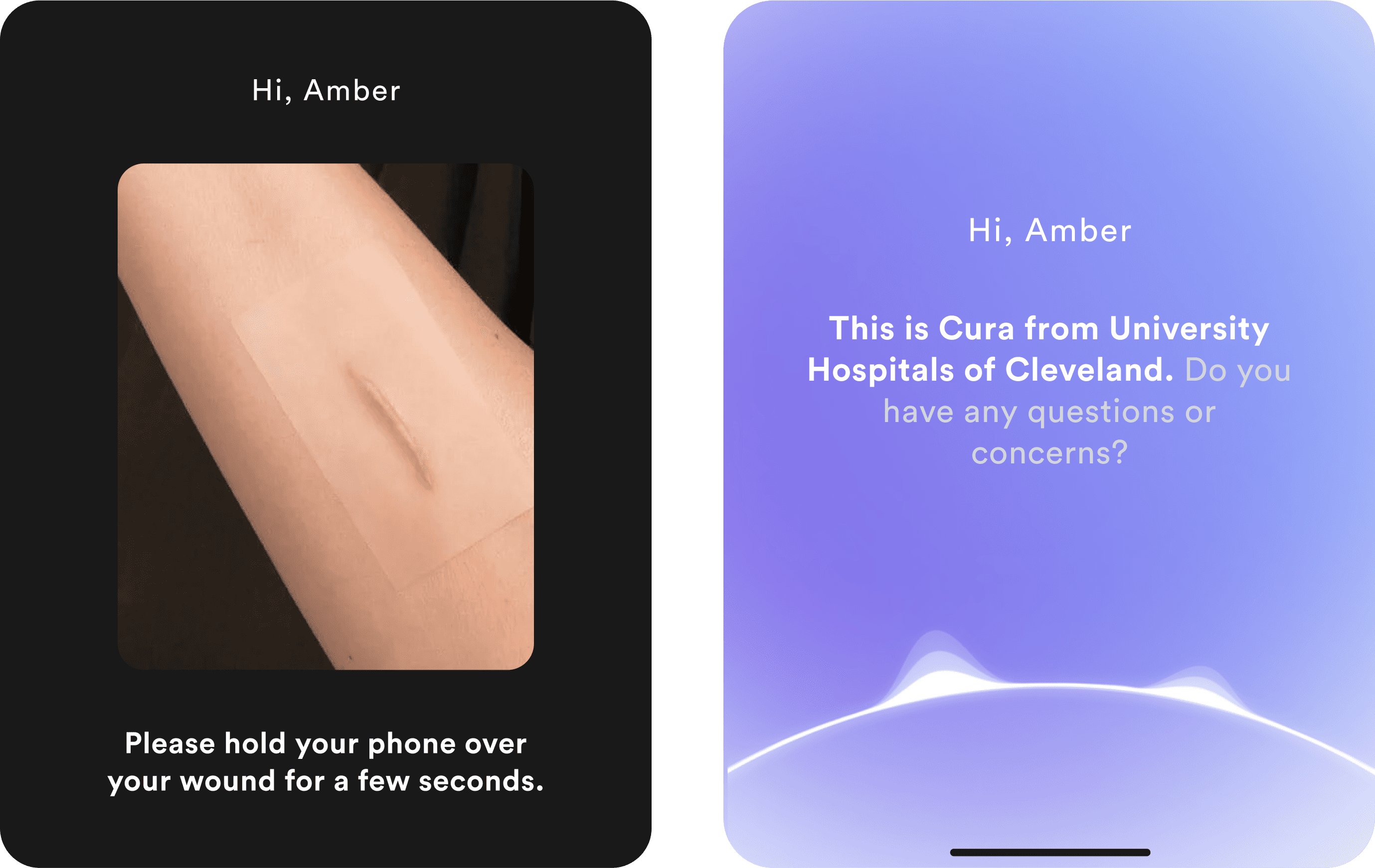
Cura asks smart follow-ups with visual aids to help patients with symptom description.
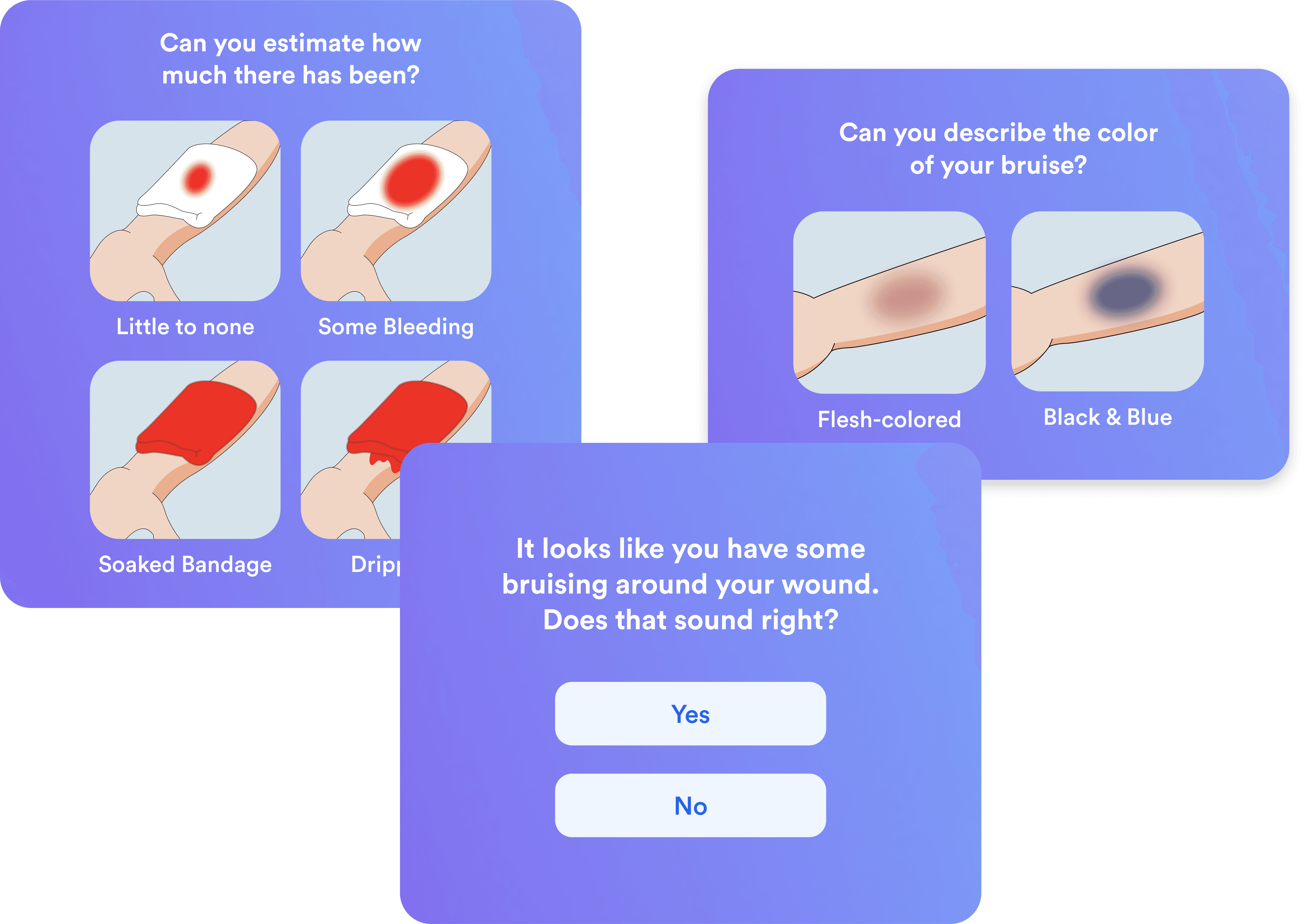
Cura offers real-time care guidance to patients based on their symptoms. If a serious issue is detected, it automatically flags the case and routes it to the clinic.
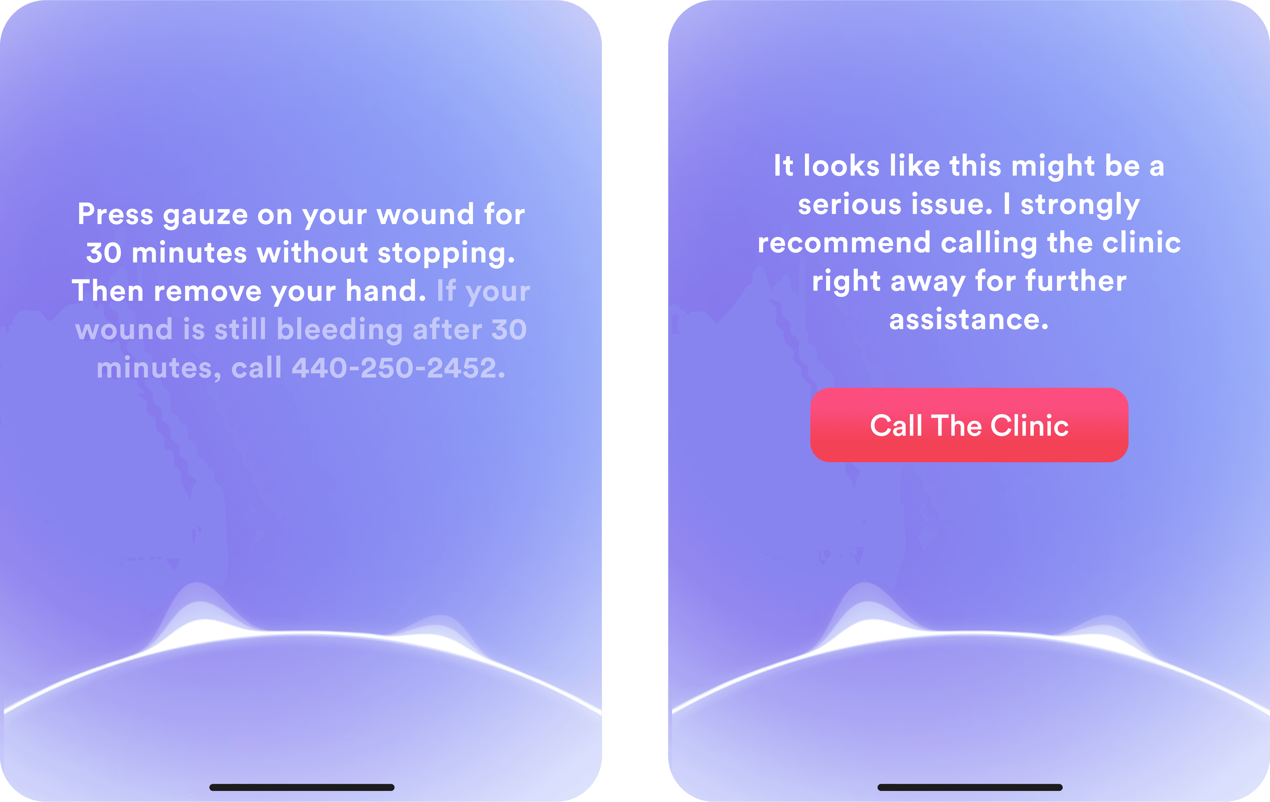
After the conversation, the system generates a concise and clear call summary for patients to refer to whenever they encounter similar problems.
DESIGN DECISIONS
Iterated on the design using task-based usability testing and A/B experiments to validate key decisions.
2
Rounds of Usability Testing
42
Patients (60~85 years old)

001
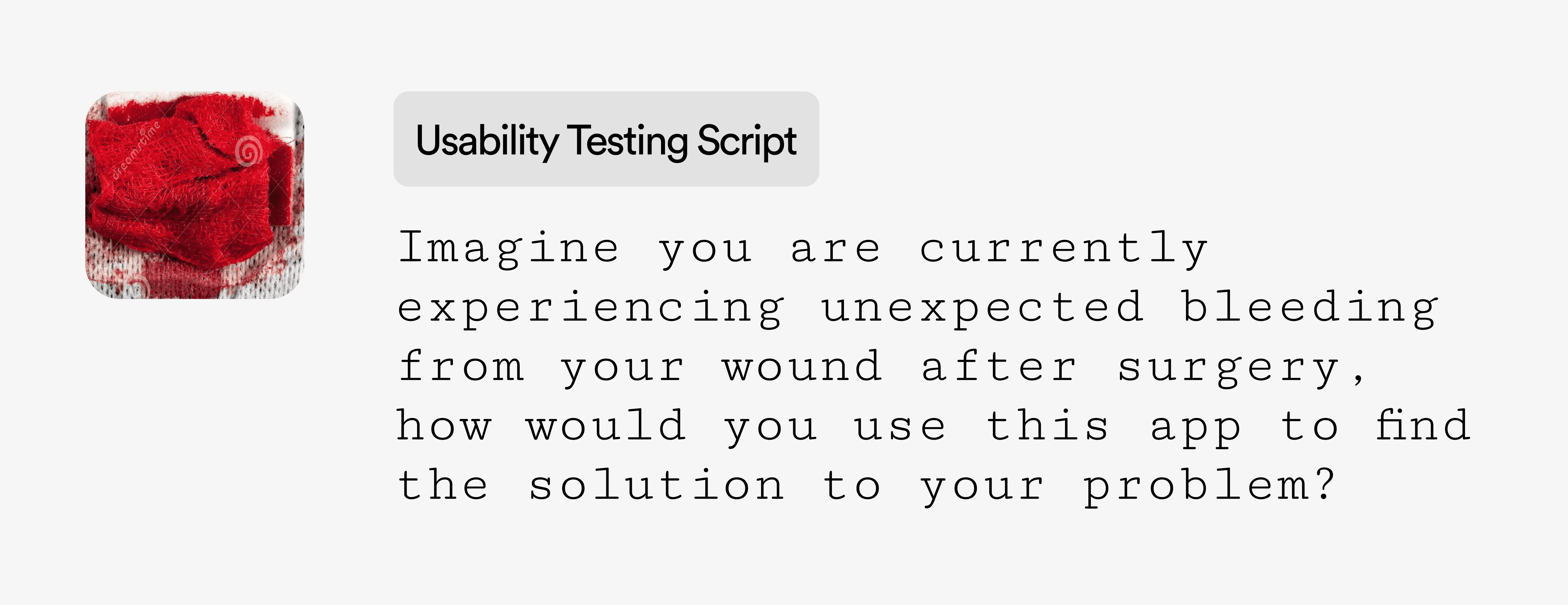
Which medium do users prefer to use first when facing urgent issues, and why?
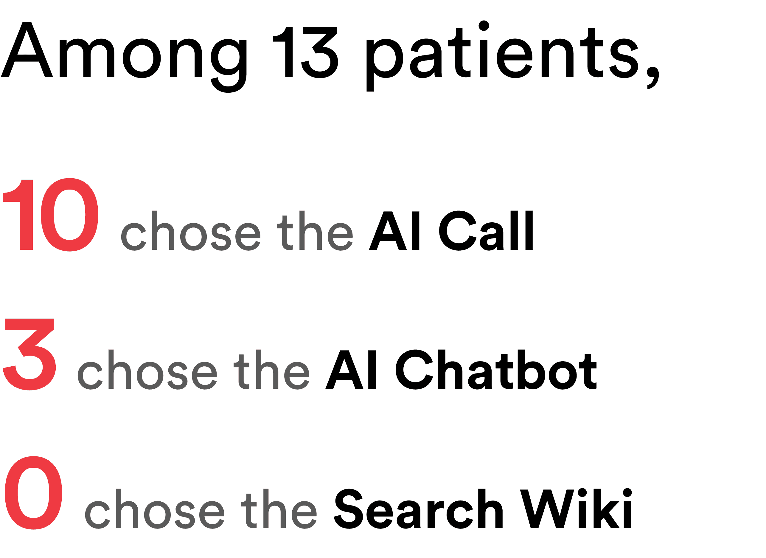
Most patients clicked on the AI Call feature when asked where they would go to get answers about their wound.
I initially presented patients with three options—AI Chatbot, AI Call, and a traditional search wiki—to evaluate their first-click behavior and uncover subconscious preferences for seeking wound care guidance.
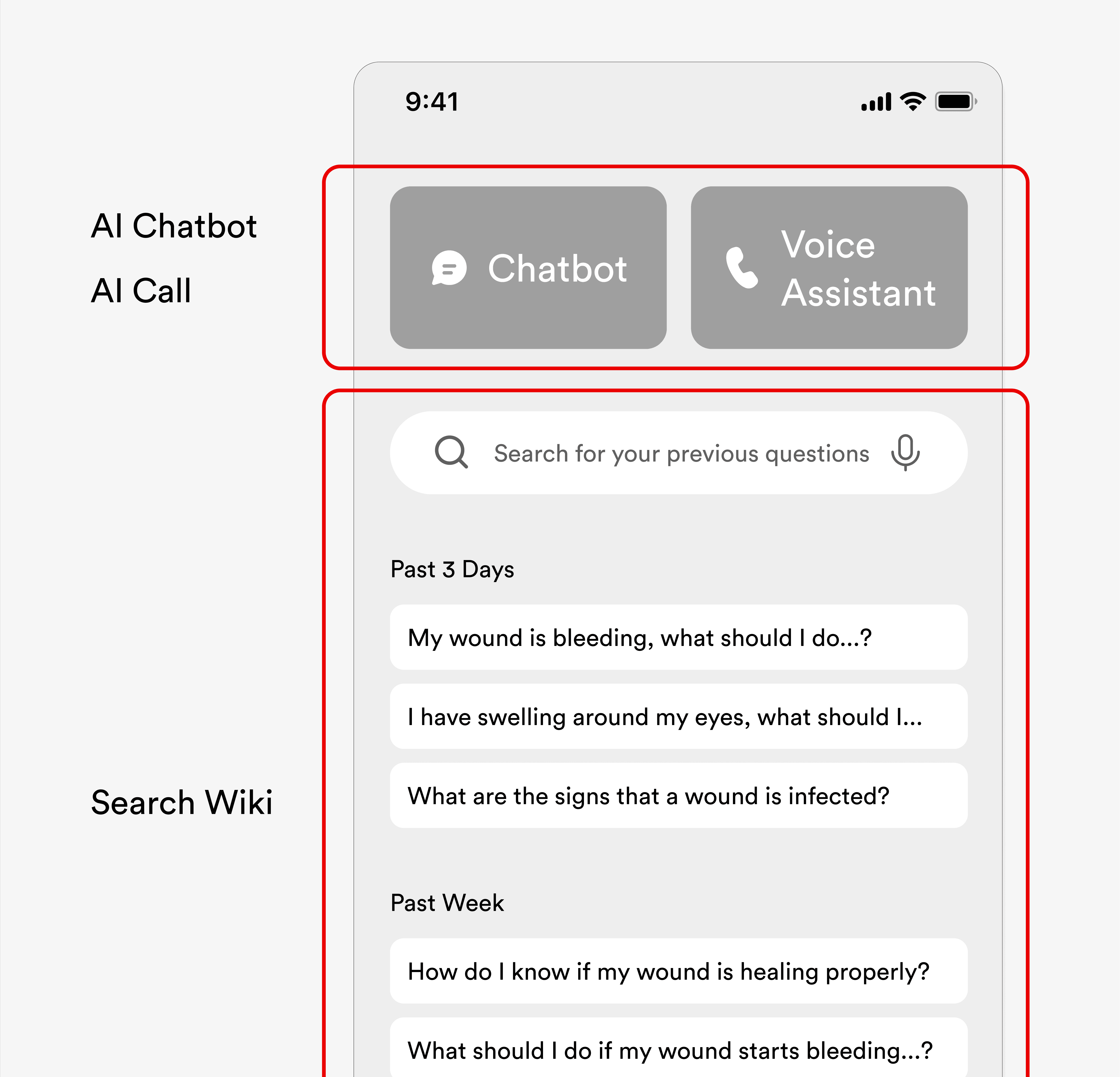
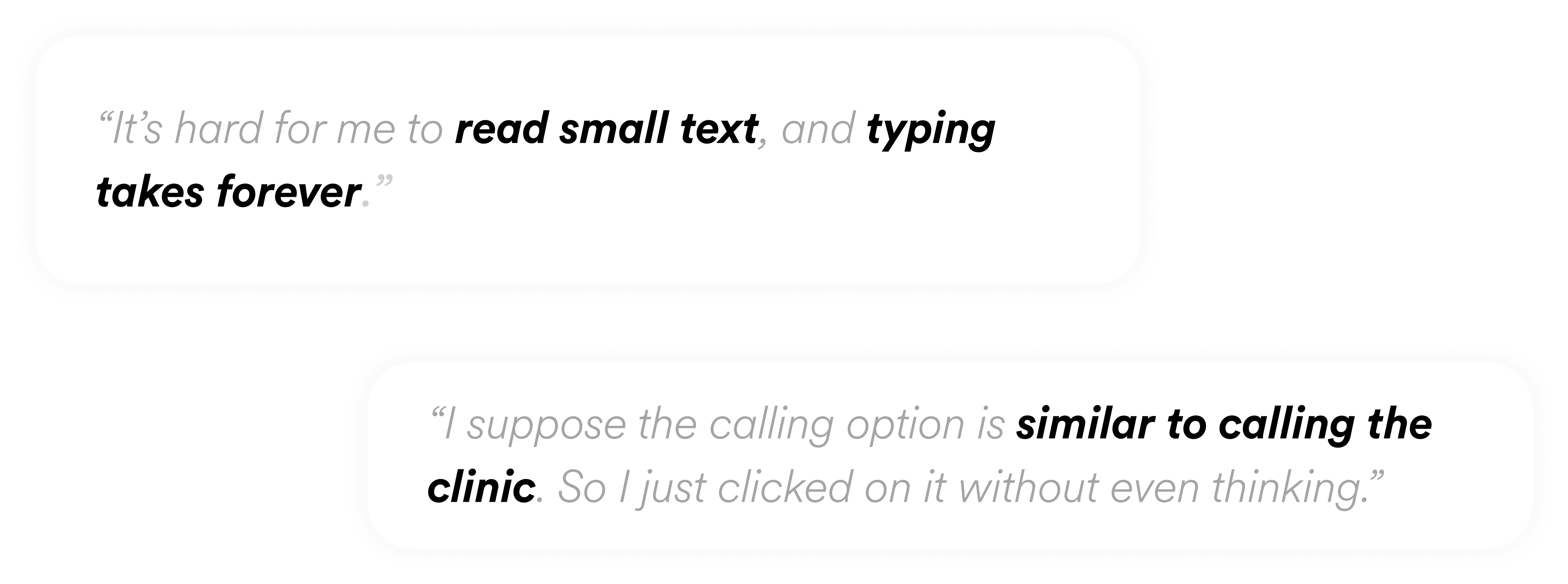
The feature was originally buried in a multi-step flow. Patients have to first go to the “Ask” page and then make a choice. This could be a problem, especially for less tech-savvy users.


Brand color; sense of calmness

Blends in too much → easily overlooked
Cohesive with chat UI
Low contrast → poor discoverability

High contrast → good discoverability
Sense of urgency
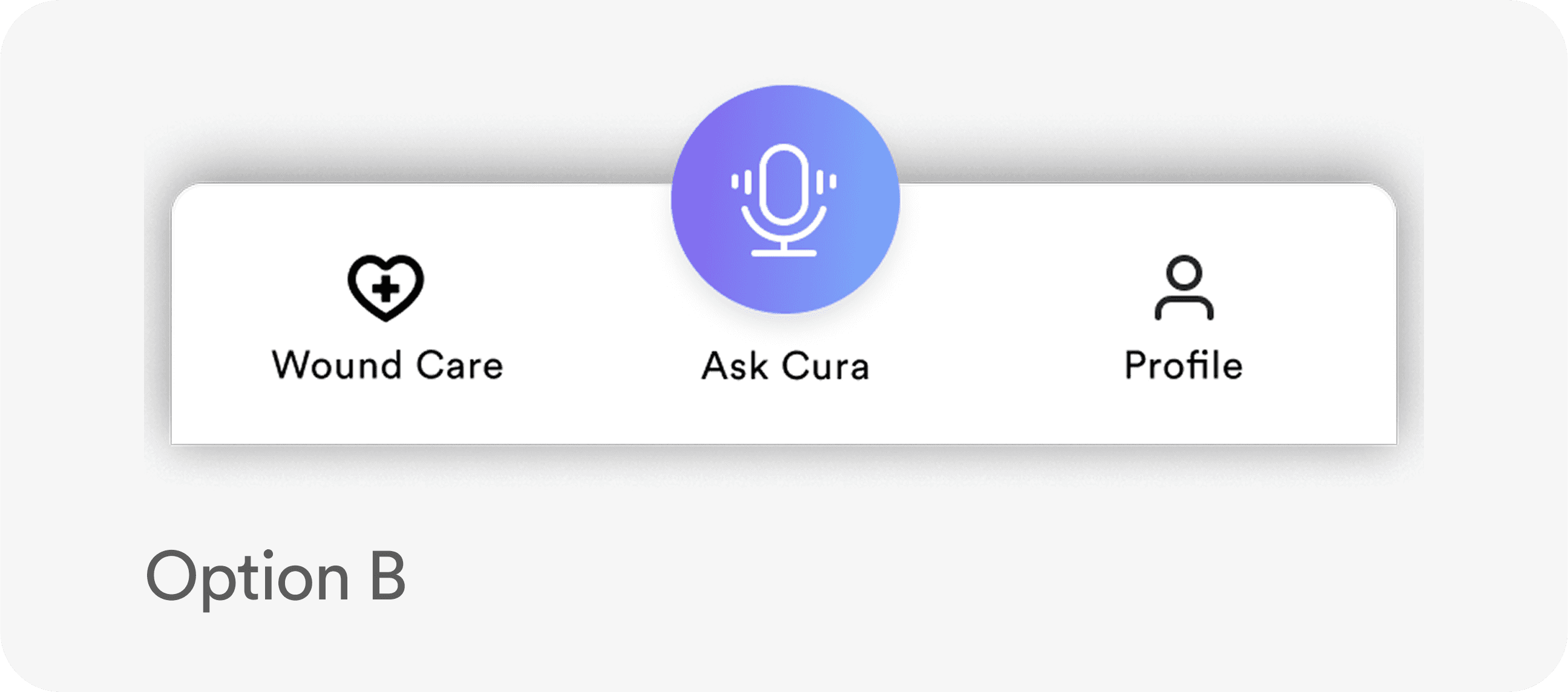
🥳 Final Design. AI Call became the sole medium of support placed in the nav bar for maximum discoverability.
In the final design, I prioritized AI Call and surfaced it in the top navigation using a bold red color for both discoverability and a sense of urgency.
002
For the chosen medium, what level & form of interaction feels most comfortable?
I conducted A/B testing to compare two interaction models—fully verbal versus a verbal + touch hybrid—to evaluate which best aligned with elderly patients’ communication habits and preferences.
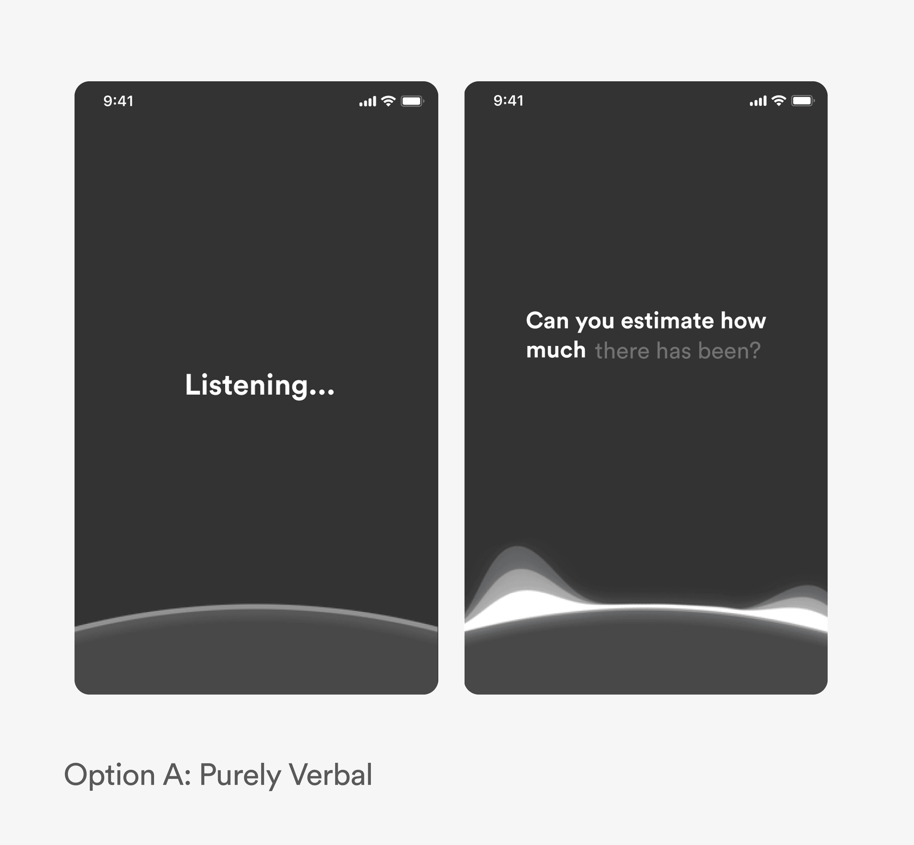
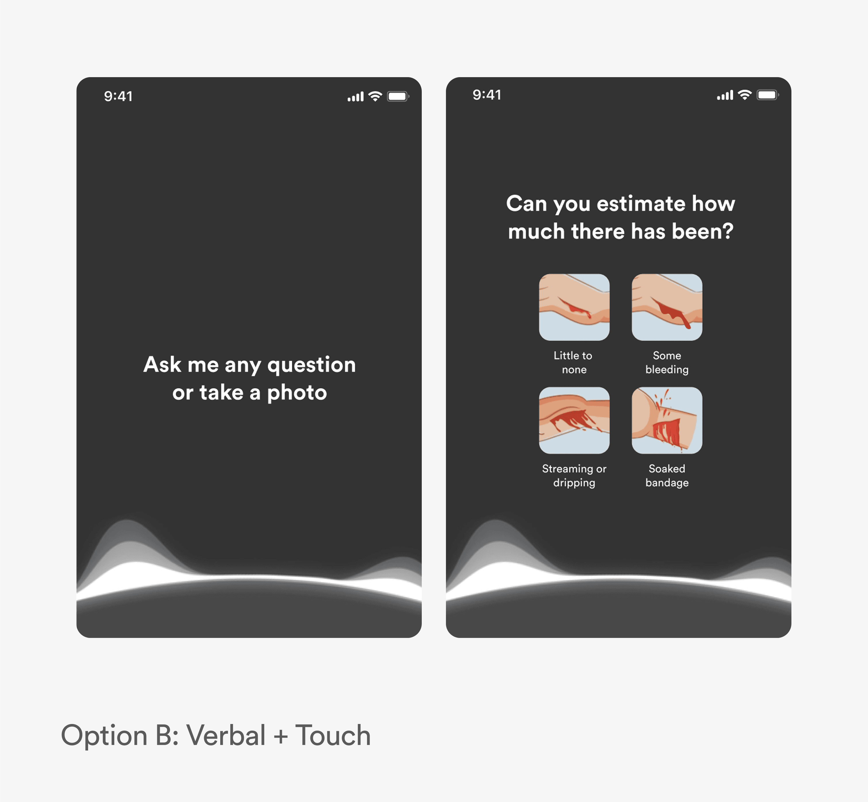
After deciding on the level of interaction, I explored the form of imagery—specifically whether to use real photos or illustrations. Real images offer precise visual detail, which can help users make clearer decisions, but they can also feel graphic or unsettling. Illustrations, while slightly more abstract, are generally easier to digest.
🥳 Final Design. Combination of Verbal + Touch Input With Illustrations To Aid Symptom Description
The final design embraces a voice + touch hybrid model, balancing hands-free convenience with tactile control.
DESIGN SYSTEMS
Building for Scalability with Atomic Design.
While the app hasn't been implemented yet, I still designed it with scalability in mind—using atomic design methodology to build a DS from the ground up, starting with atoms like color and typography and scaling to reusable, modular components.

